Brand strategy and identity for a wellness brand transforming lives for the better.
- 200% growth in 6 months
Aduco reached out to 8PTS to design their new logo and visual brand strategy as they transitioned away from their old brand, Standard Process. 8PTS has elevated Aduco’s brand identity and communications to better connect with and grow their target audience of high-end, health conscious customers. 8PTS began with a deep audit of Aduco’s existing business communications followed by clear recommendations for new strategic branding goals.
The number 8 symbolizes harmony, and that was reflected in 8 Point Studio’s work. The team maintained a harmonious blend of creativity and innovation in developing our stunning new brand.
Henry Mobley, Vice President, Aduco
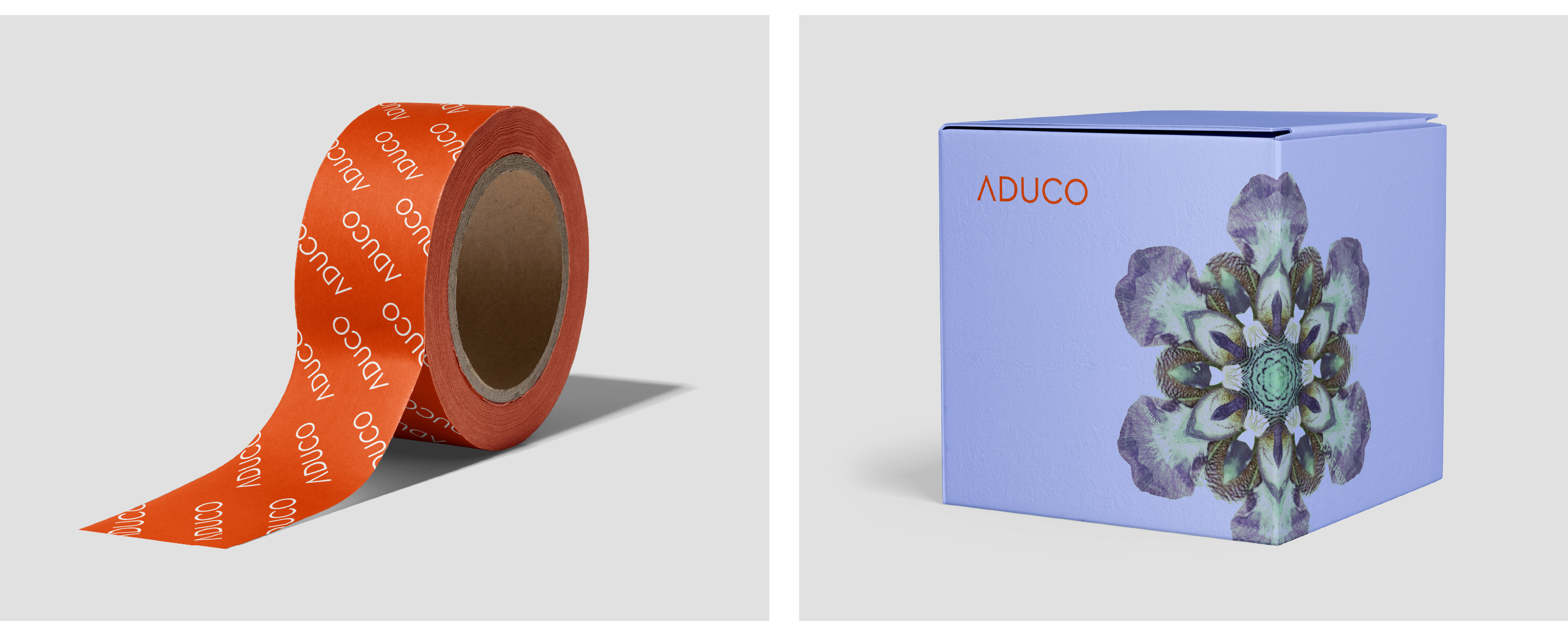
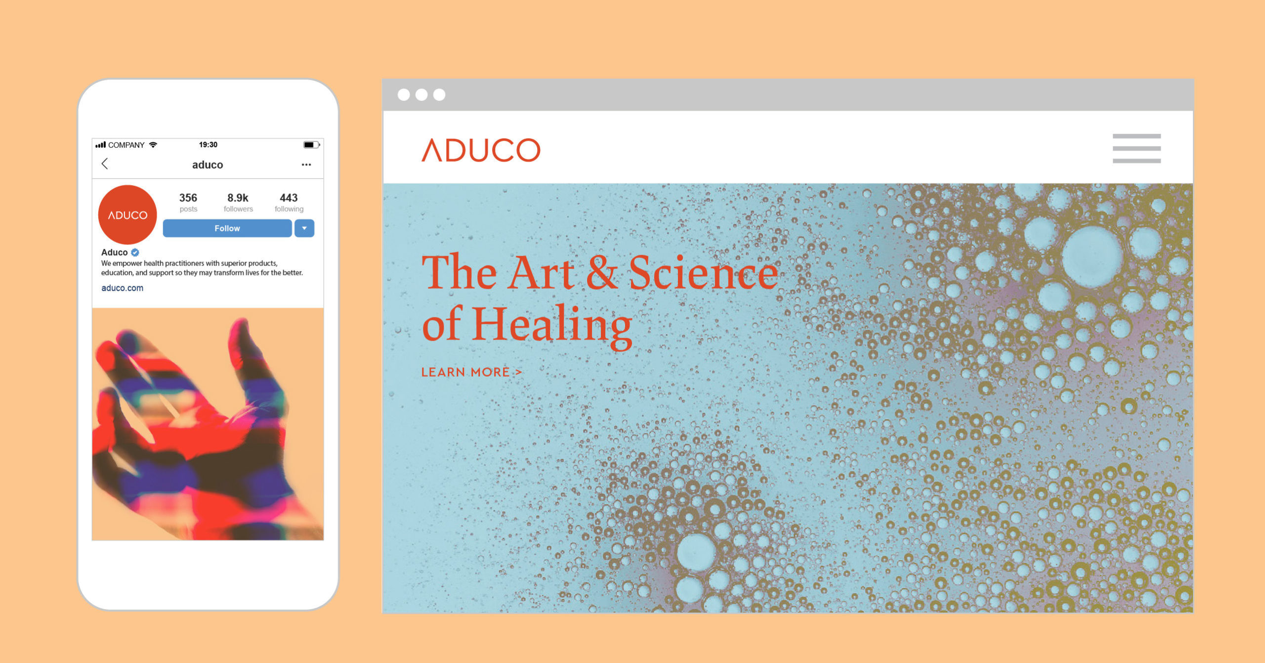
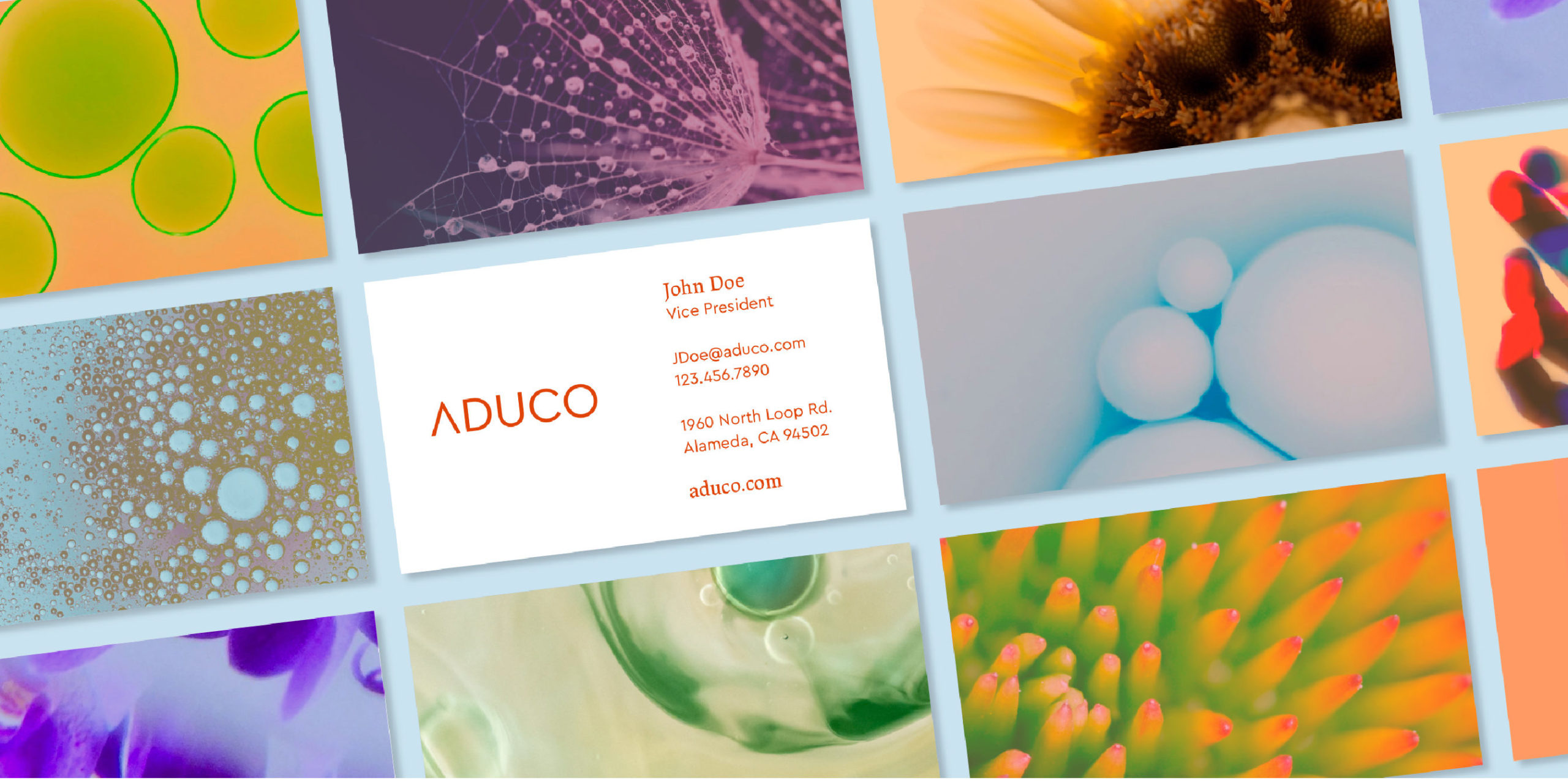
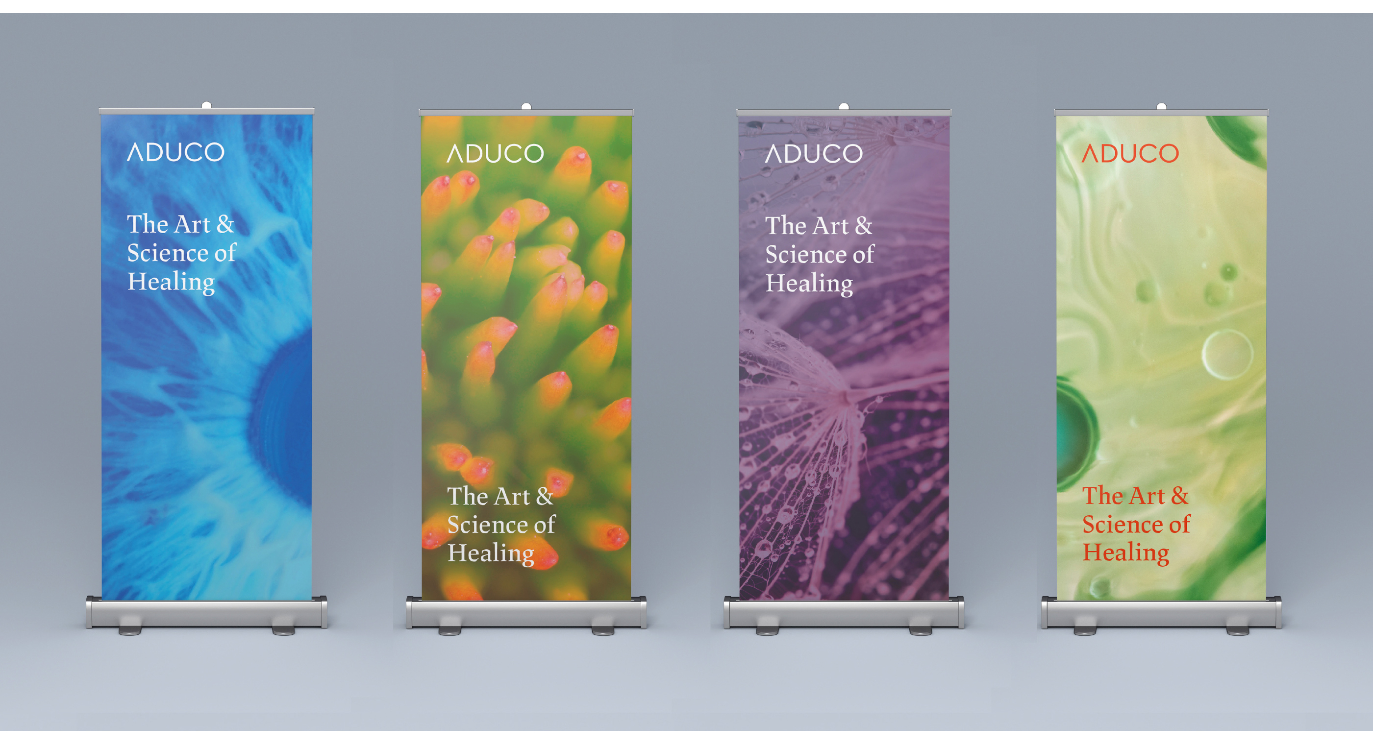
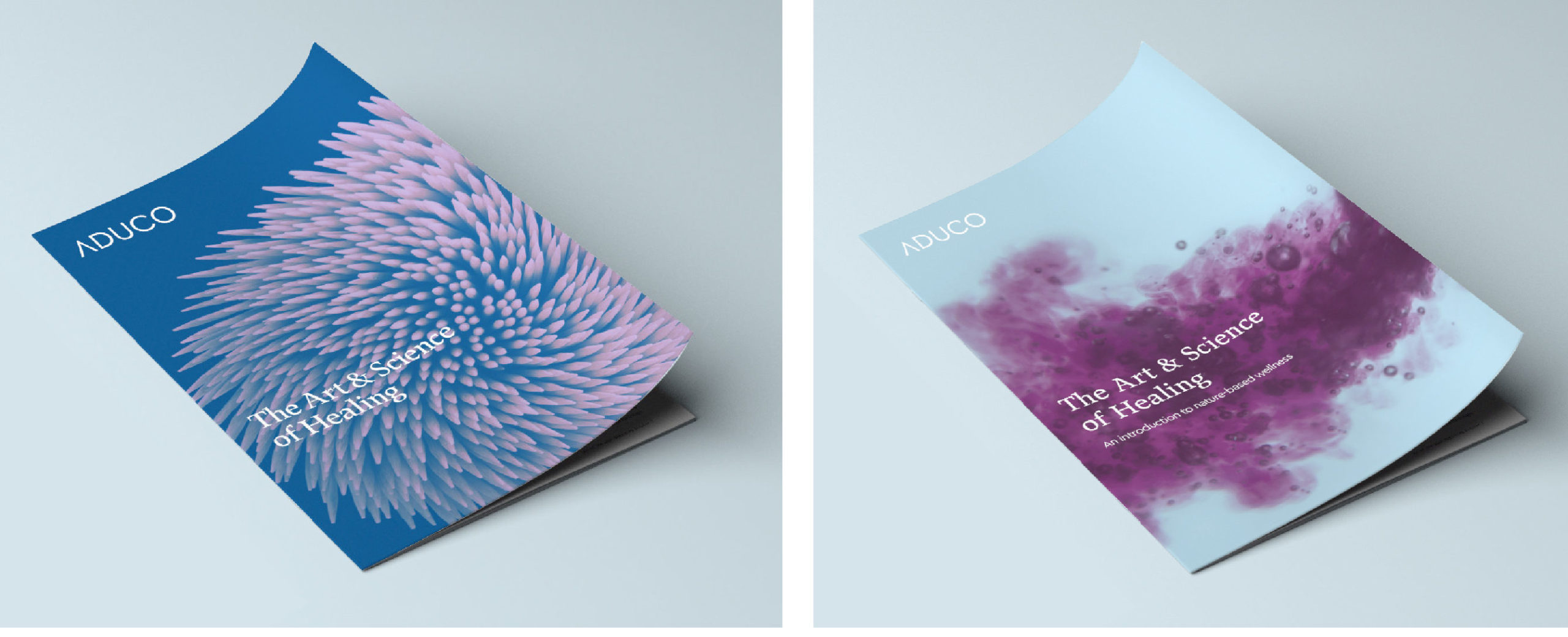
After a comprehensive visual exploration, 8PTS developed a new logo for Aduco that is clean, minimal and modern while referencing the upward growth that Aduco generates for its customers. The sleek “A” absent its crossbar, can be read as an arrow or mountain peak. The rounded, all-caps letterforms provide a feeling of openness and honesty. The new, warm, primary brand orange color is optimistic and energizing.
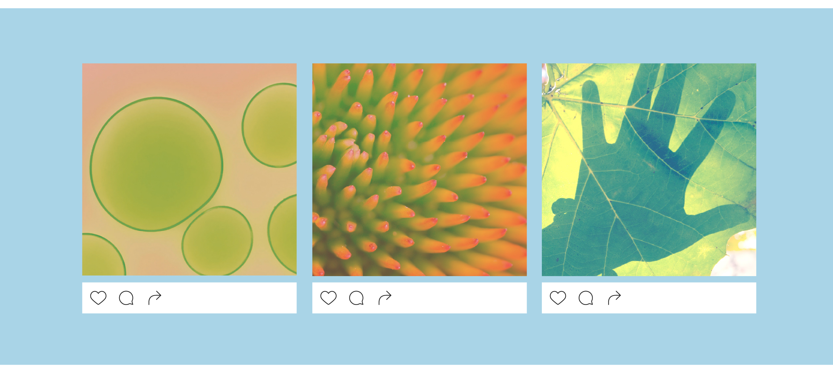
Aduco’s original communications were heavy-handed and utilized uninspired stock imagery. The new brand visuals developed by 8PTS communicate a visually engaging and poetic beauty around the notion of health.
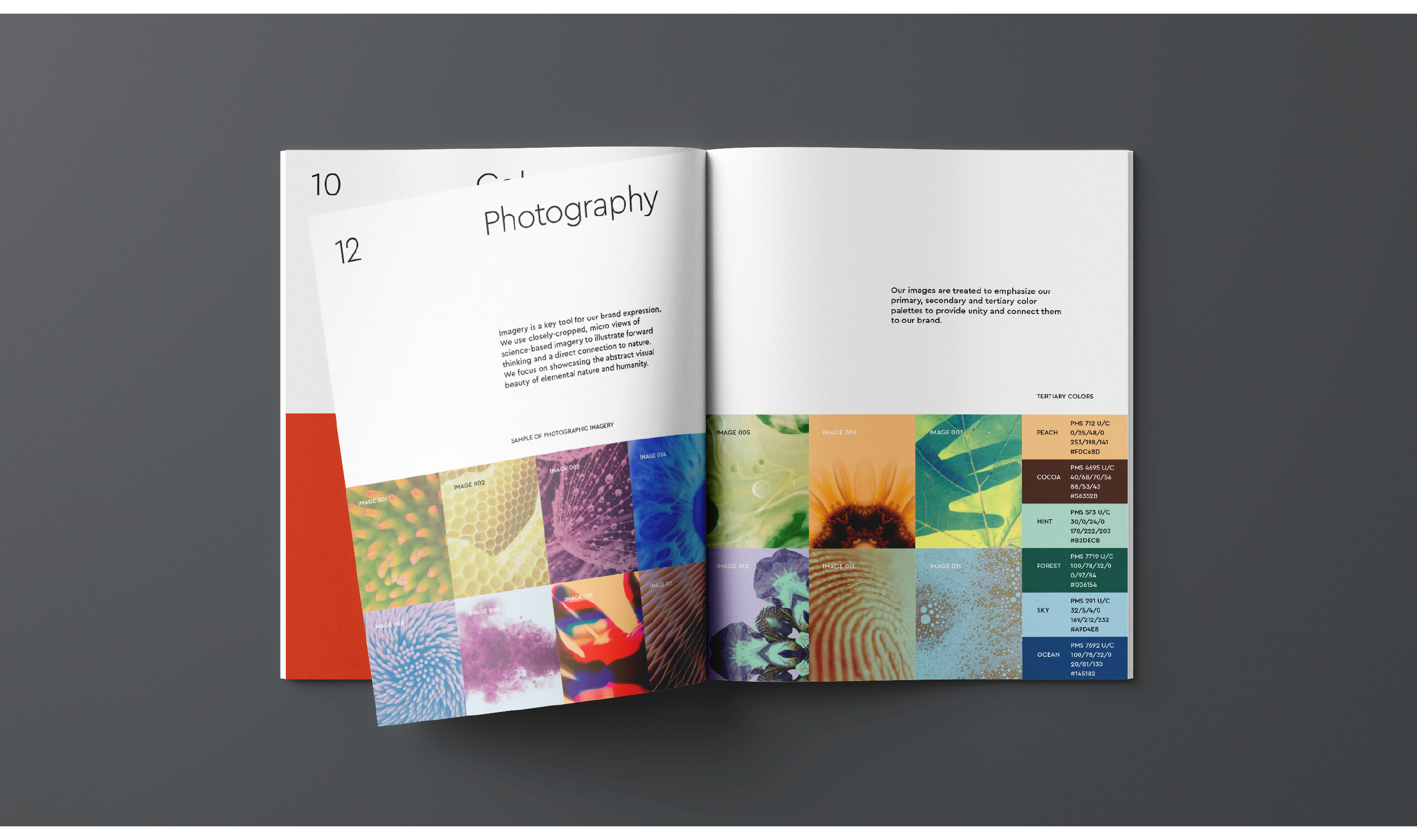
For the communications system 8PTS developed a striking approach incorporating macro photography of natural ingredients. The beautiful, abstract images speak to the underlying power and awe found in nature along with its soothing, healing properties.
The new graphic system is elegant and connects strategically with Aduco’s audience of savvy, high-end customers seeking health-based medicine grounded in nature and unified by a deep appreciation of the environment.
Thank you again for all of the fabulous work you and your team have done. The branding of Aduco is amazing!
Andrea Parrino, Marketing Manager, Aduco