Branding and website for the documentation of gender persecution and conflict around the world.

In conflicts and crises across the globe, gender-based crimes have been perpetrated, but are hardly ever held accountable. Human rights defenders are working to change that.
The Gender Persecution Observatory consolidates large amounts of data and research on gender-based harms in conflicts across the world and throughout history and analyzes how they may amount to gender persecution. By raising awareness, the goal is to build survivor justice and sustainable peace.
The team at CUNY Law’s Institute for Gender, Law and Transformative Peace approached 8PTS to help them strategically brand and structure a way to share the ground-breaking work from the Gender Persecution Observatory in order to build engagement and grow awareness.

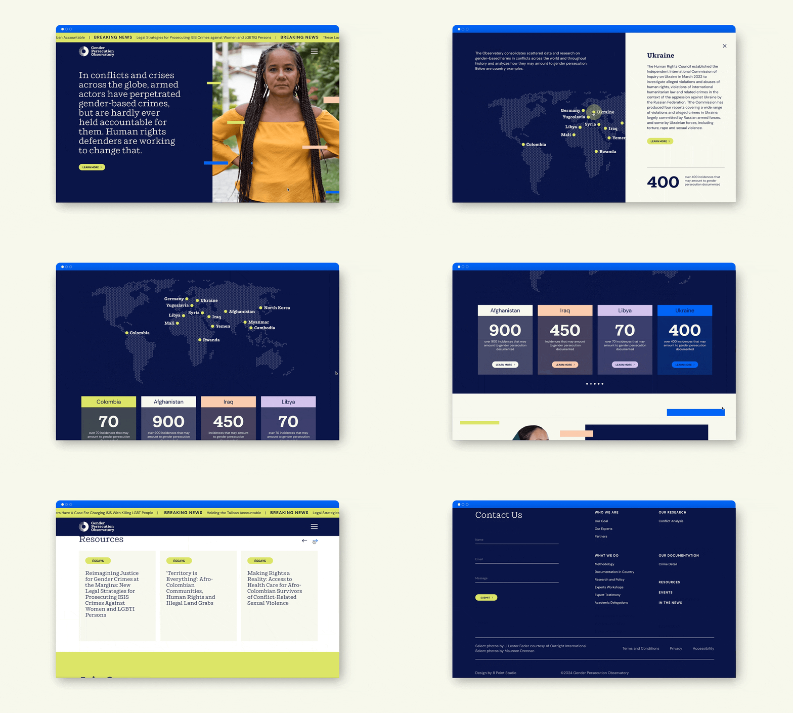
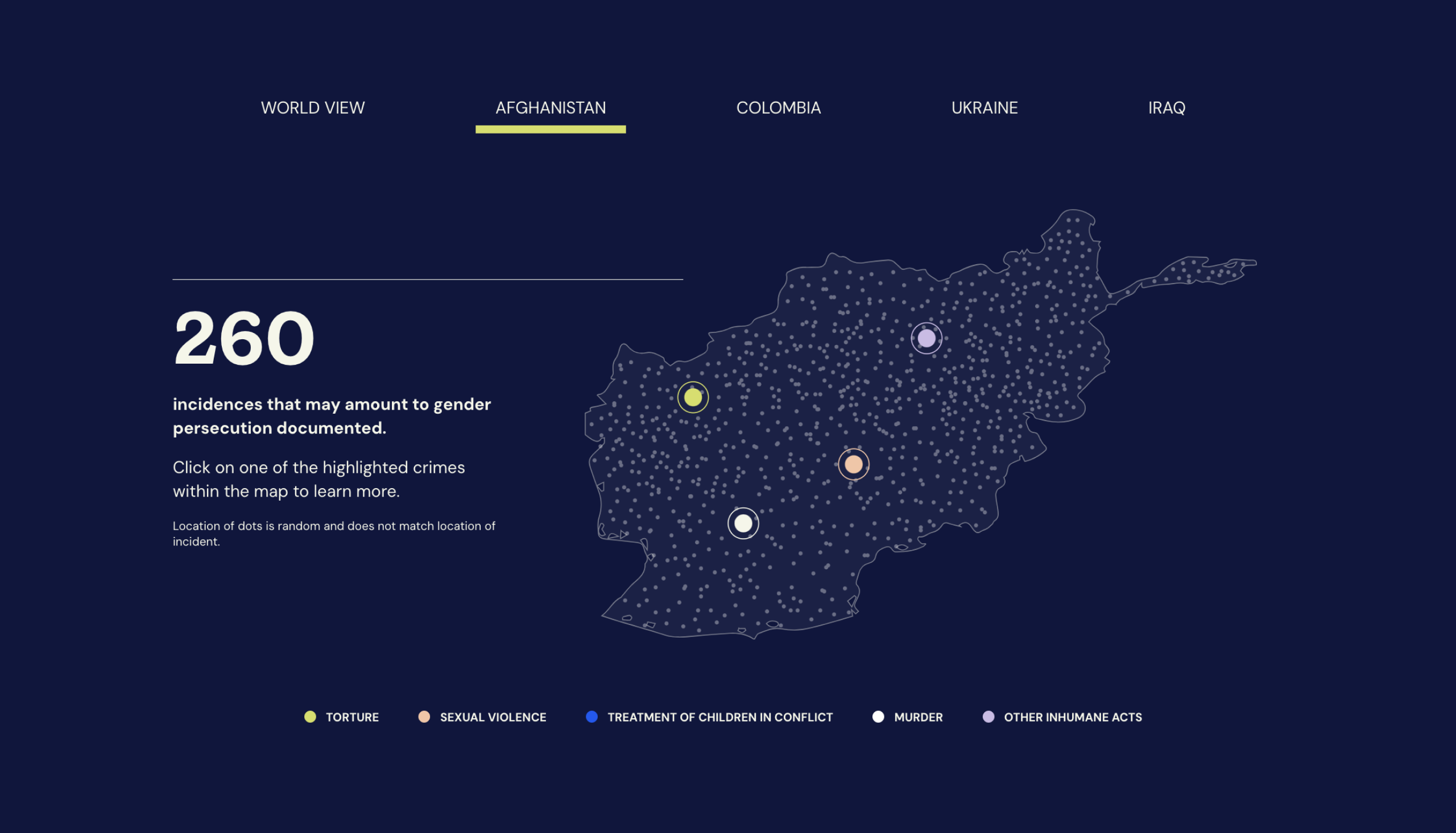
We leveraged compelling data and interactive infographics to strengthen the Observatory’s storytelling and engage their audience.
Lindsay Giuffrida, Creative Director
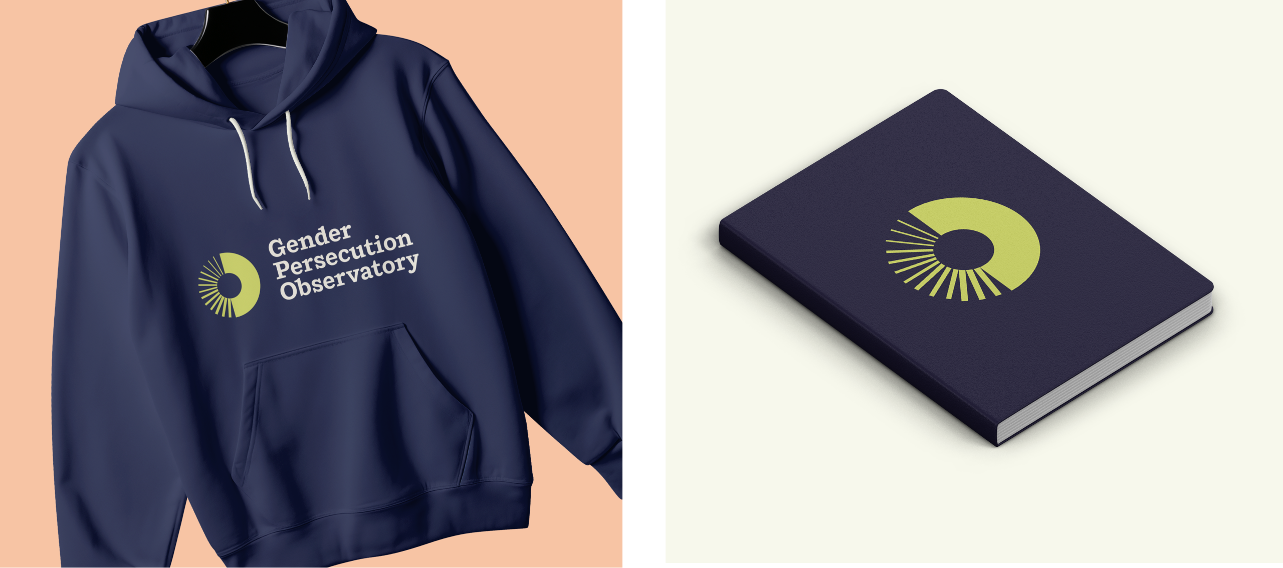
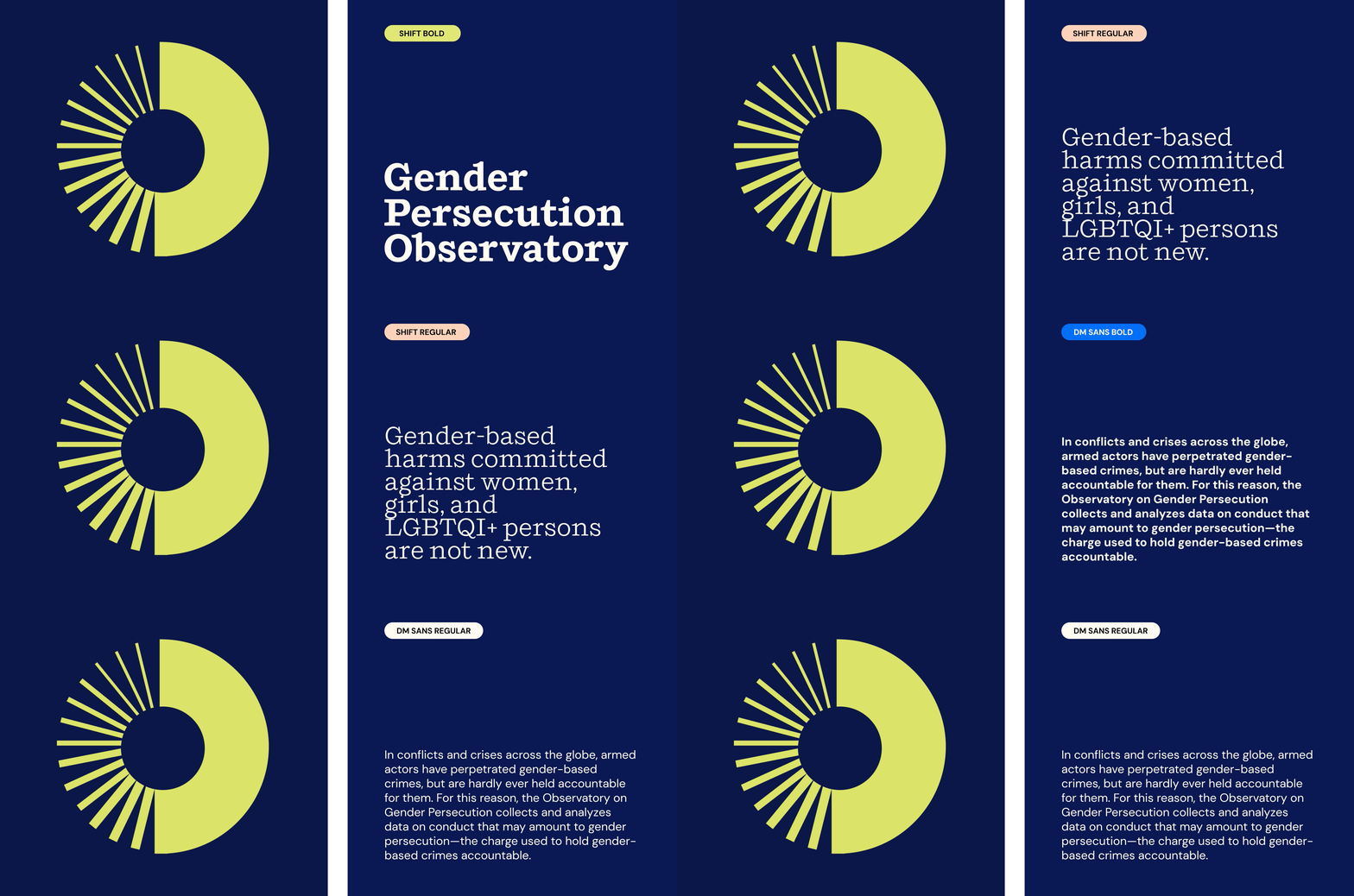
The team at 8PTS convened introductory strategy sessions to clarify mission and messaging and to determine clear project goals. An in-depth logo study yielded a clean yet distinctive circular mark. Repeating lines represent discreet incidents that begin to converge and combine together to create a solid block of strength through witness. The circular form resembles an eye which references the important act of observing and documenting crimes as they occur.
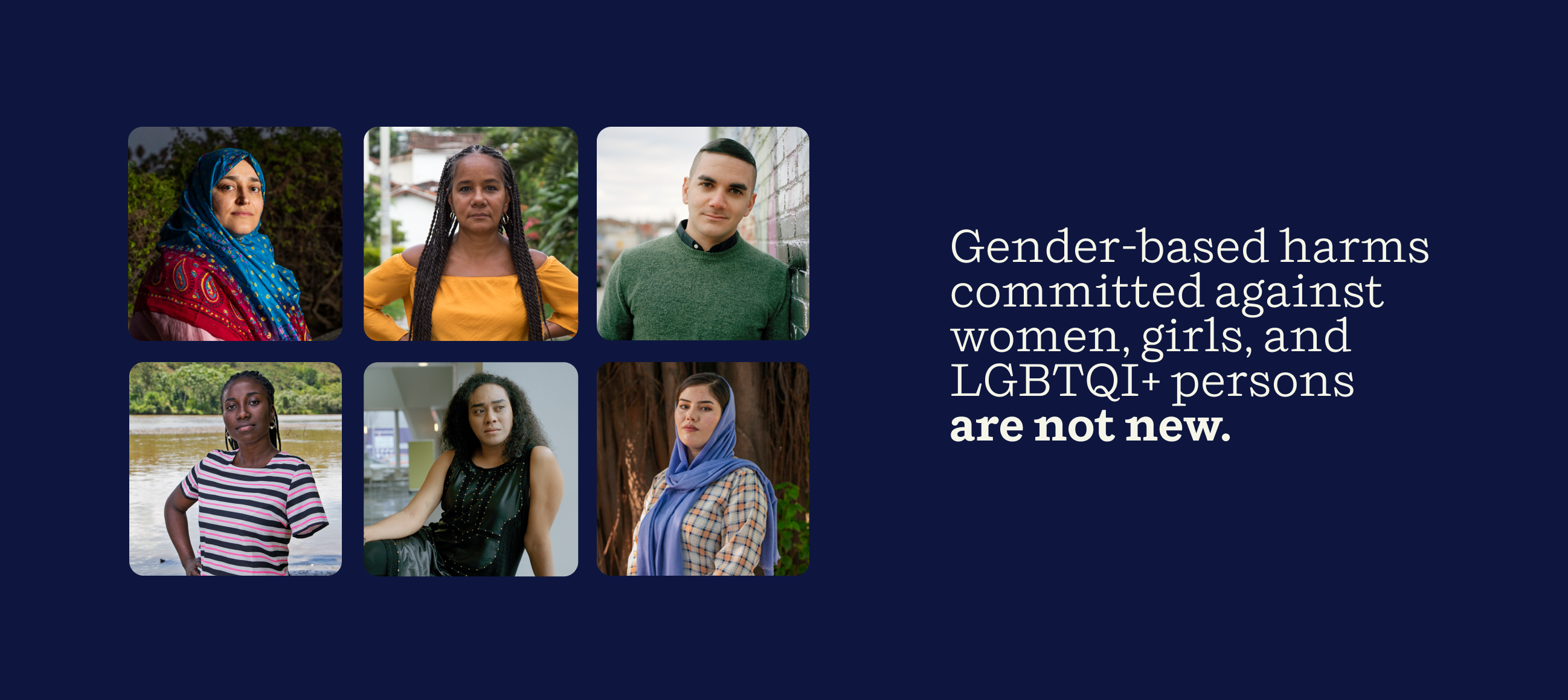
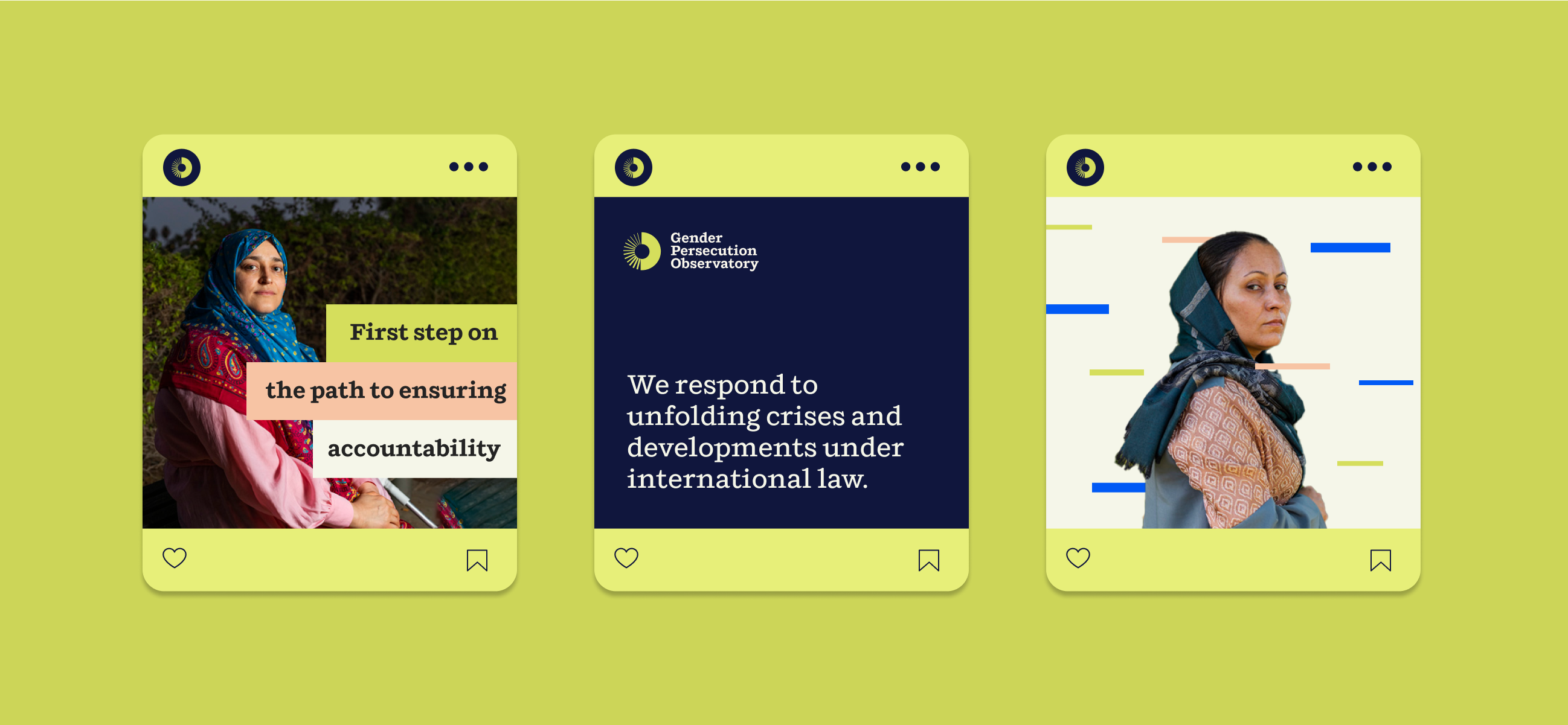
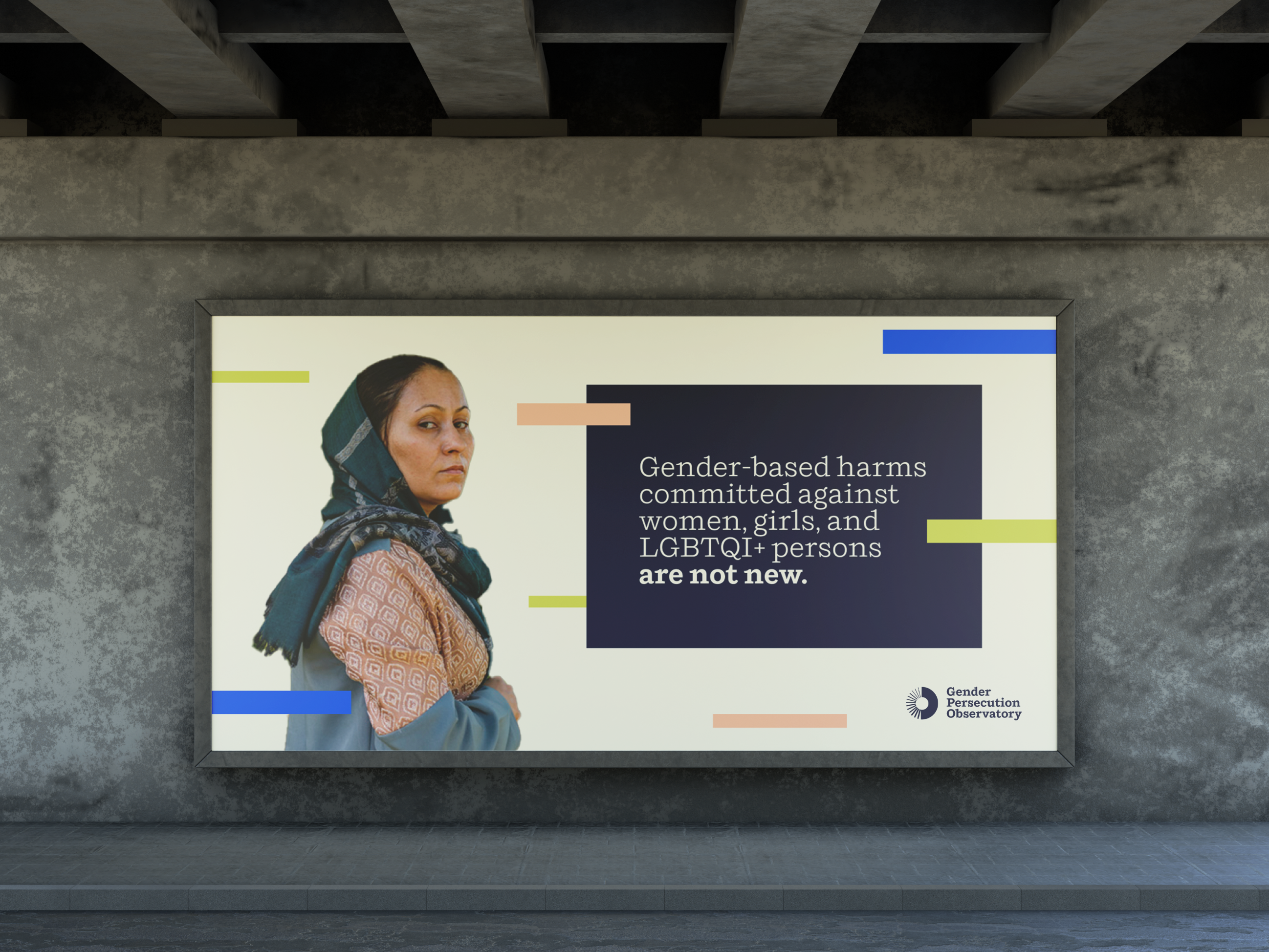
A balanced, rounded and highly legible typeface was selected with unique angled top serifs that allude to a sharpness and directness that is appropriate to the serious and provocative content the Observatory collects. A visual system of colored dashes – reminiscent of the short lines from the logo mark – interacts with photography and messaging harkening to the multi-layered data on the site as well as to the attacks many of the individuals presented have suffered. The dashes are positioned and change scale to purposefully create a sense of depth that brings the photographic documentation to life. Photographic portraits have been taken to present strength over victimhood. Another goal was to avoid any gender-based color clichés. The brand color palette is grounded in a dark navy blue which is serious without being heavy or depressing. The supporting colors – yellow, peach, electric blue and off-white – provide a strong contrast and generate a glowing sense of urgency.
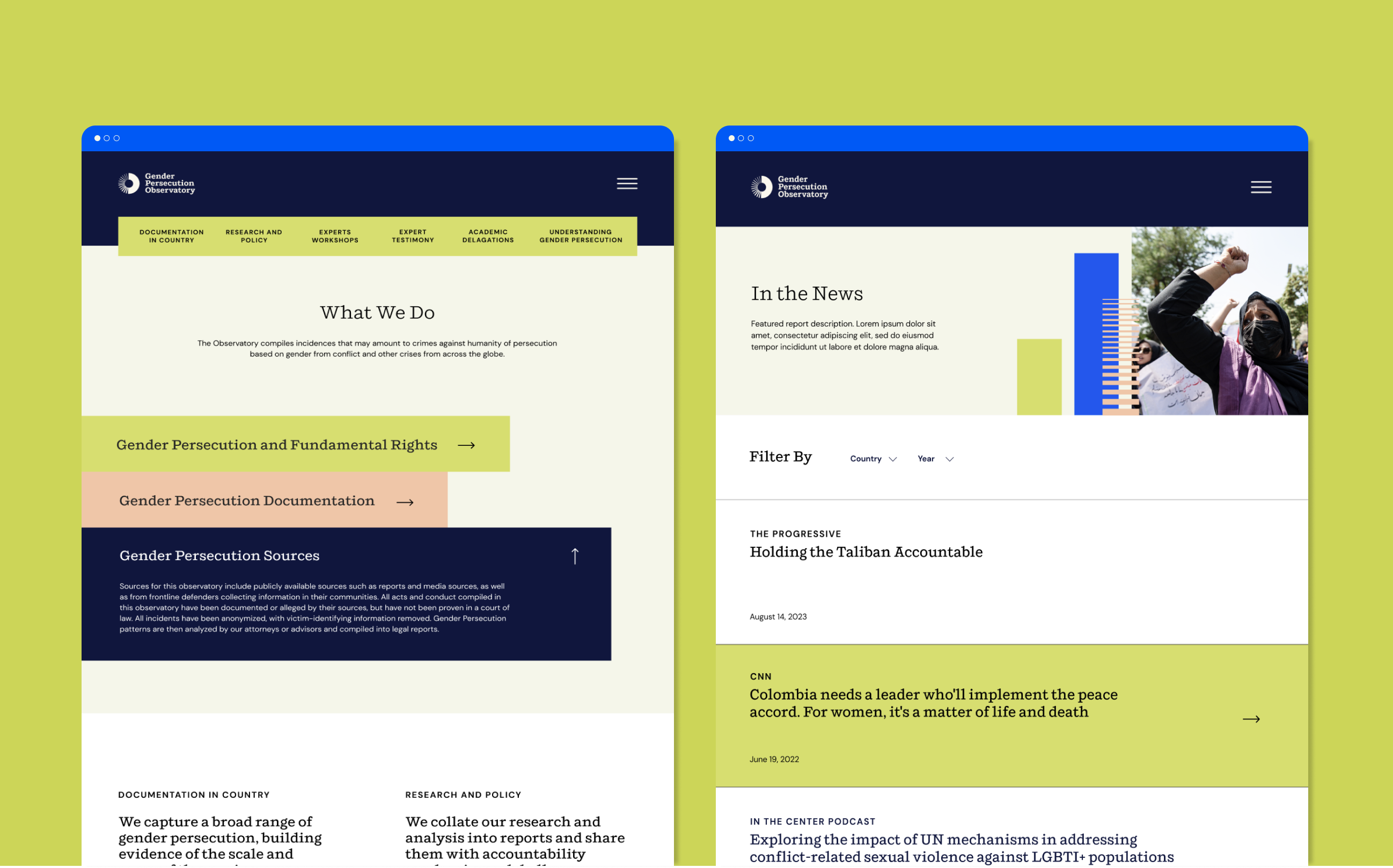
A large part of the strategic project development involved 8PTS’ successful organization, data visualization and UI/UX for the extensive critical information gathered by the Gender Persecution Expert Group comprised of high-level experts recognized in the fields of international human rights law, international criminal law and gender justice across the world.
The team at 8PTS developed an interactive digital mapping system and information design for the website to create a clear and engaging way for visitors to navigate the complex data, learn about the different countries involved, understand and activate around the wide range of gender-based crimes occurring.
