Branding for an AI platform providing trusted and inclusive healthcare.
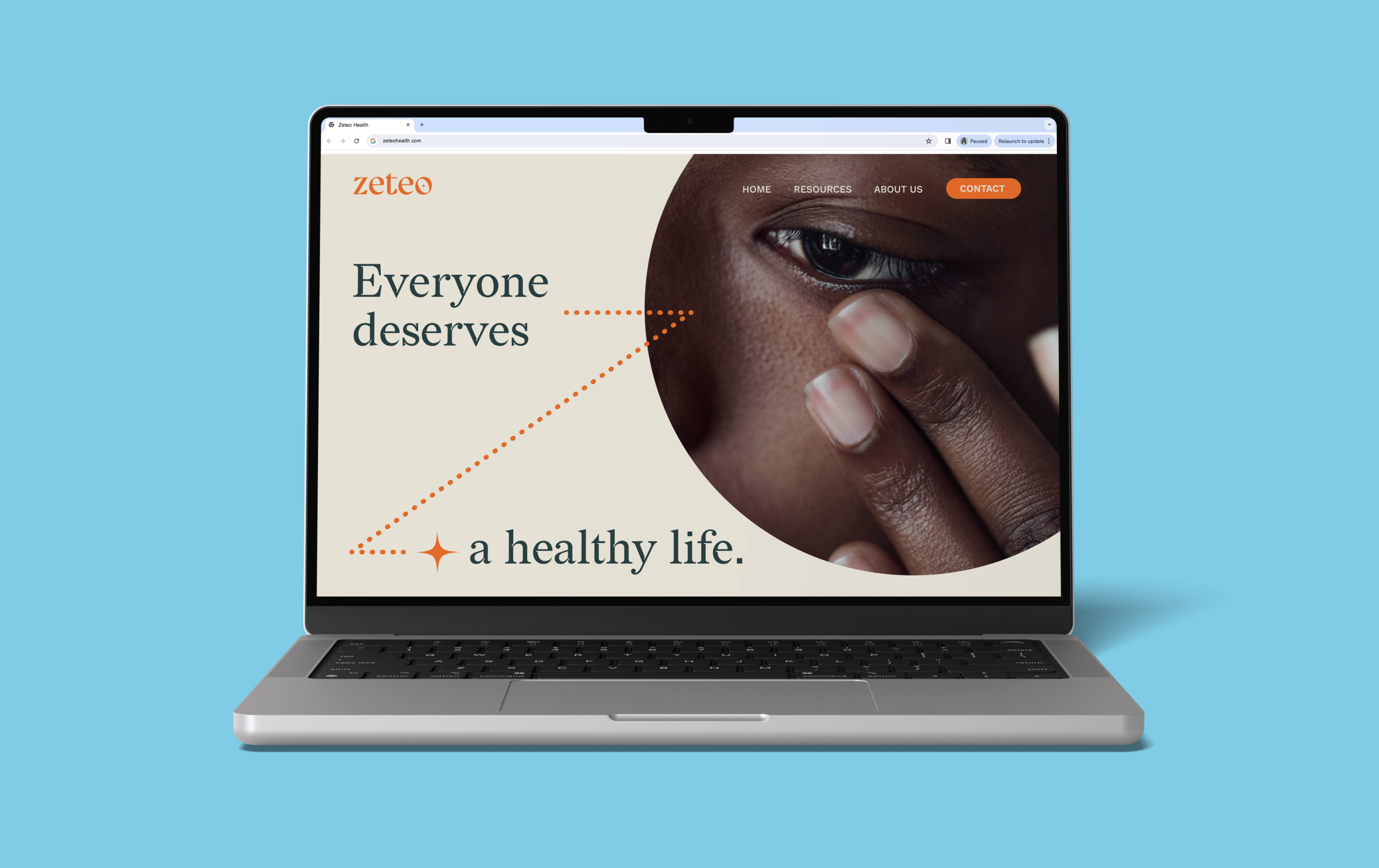
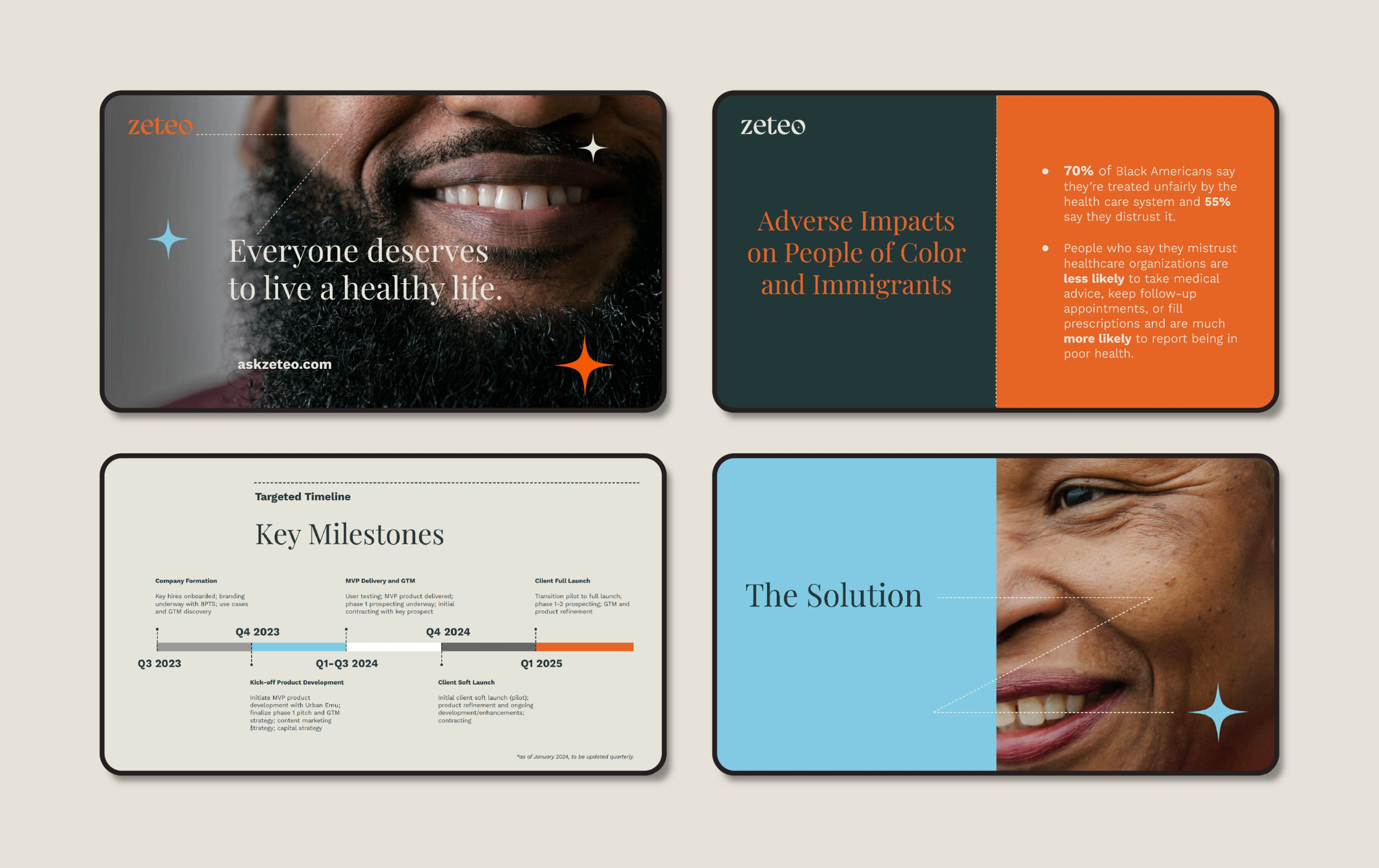
Everyone deserves to live a healthy life. Zeteo Health accelerates access to care and patient engagement through inclusive, personalized health information. Founder Kevin Dedner is an experienced public health executive with over twenty-five years of experience solving complex public health problems. The goal of Zeteo’s AI-powered platform is to empower members to take control of their healthcare with curated resources and condition-specific content.
Zeteo harnesses the power of AI to provide personalized health resources and guidance, allowing diverse members to access care efficiently and engage more effectively.

We wanted a brand that was unique and spoke to our vision of transforming healthcare. 8 Point Studio delivered.
Kevin Dedner, Co-Founder and CEO
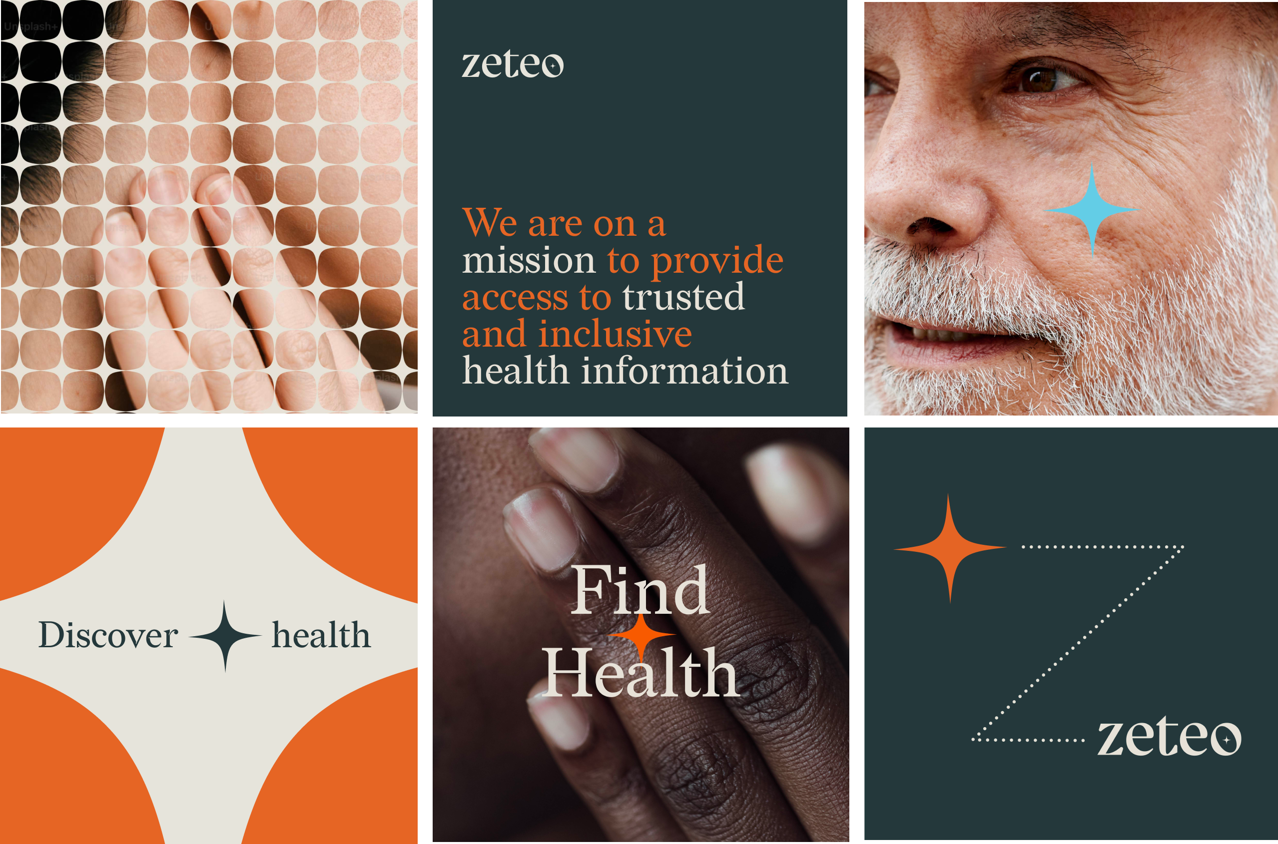
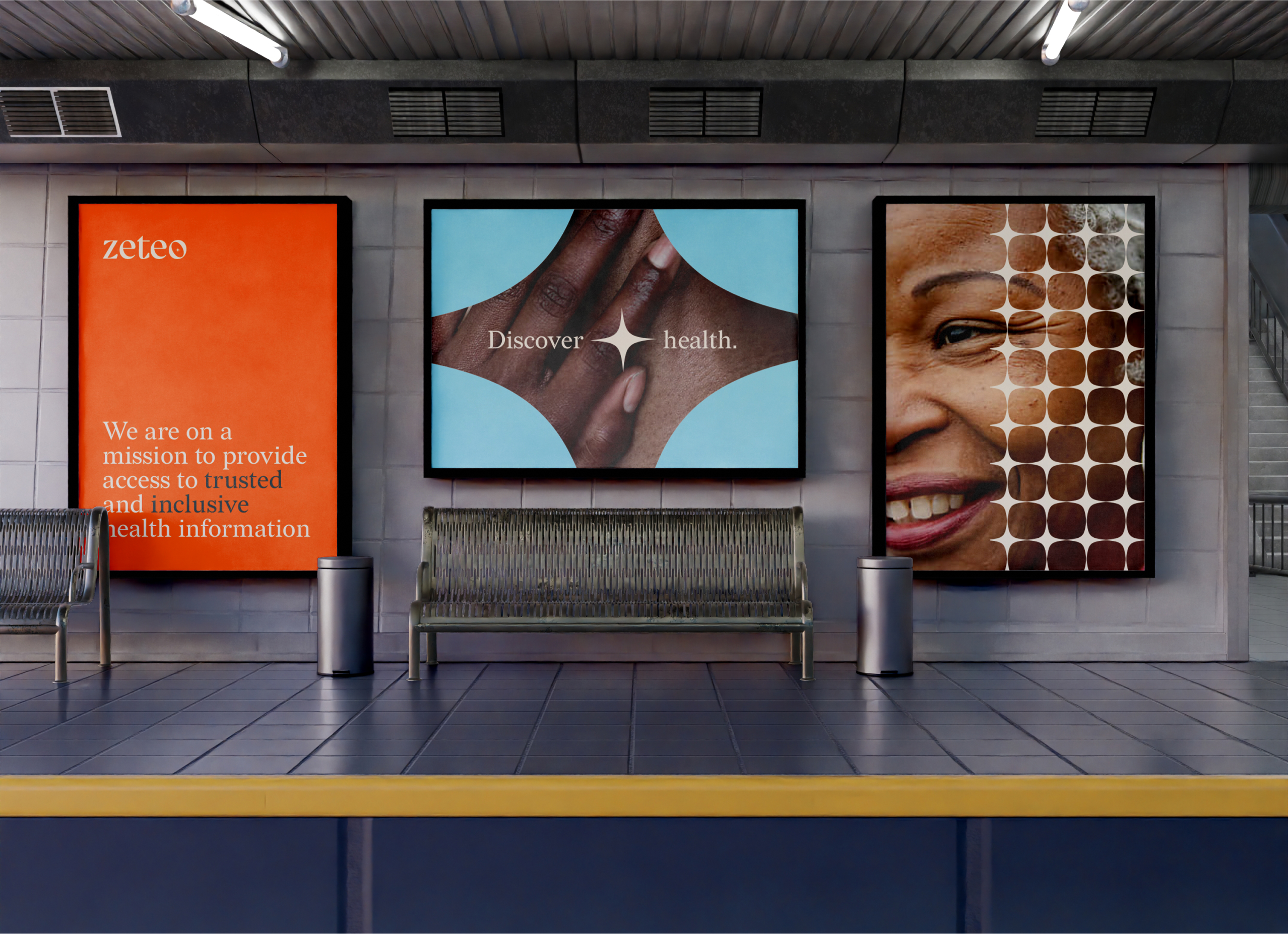
At the early investment-seeking stage, Zeteo needed to present a clear and compelling case for the ability of AI to help diverse members increase engagement with healthcare. The brand needed to appear trustworthy, inclusive and joyful, especially since health issues in general can be intimidating and certain communities have historically experienced a lack of trust.
The 8PTS team conducted a day-long brand strategy workshop to outline and strengthen Zeteo’s mission and positioning. Based on clarified language and messaging, the brand direction was developed to capture the sense of warmth, friendly support and positive energy that Zeteo embodies.
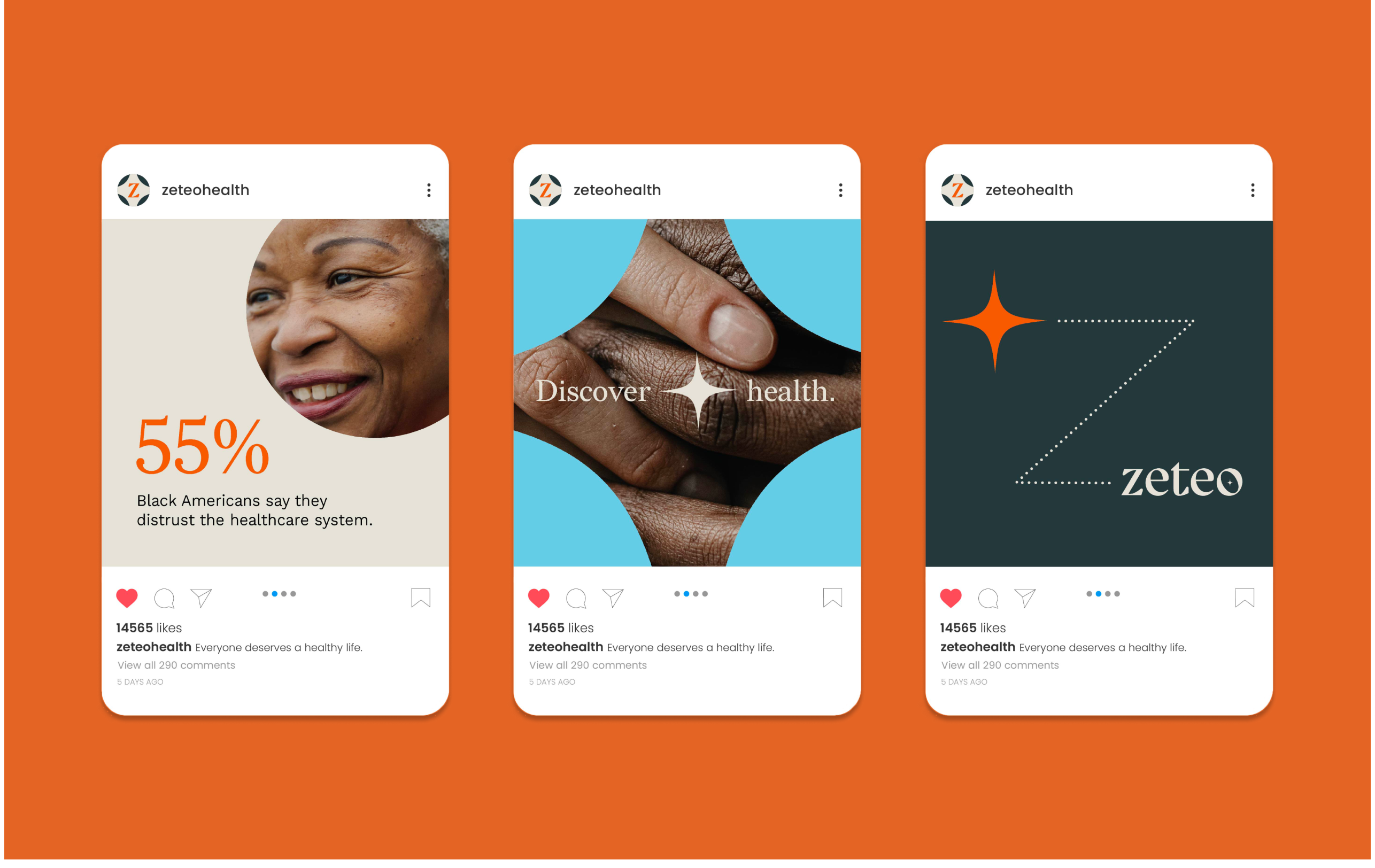
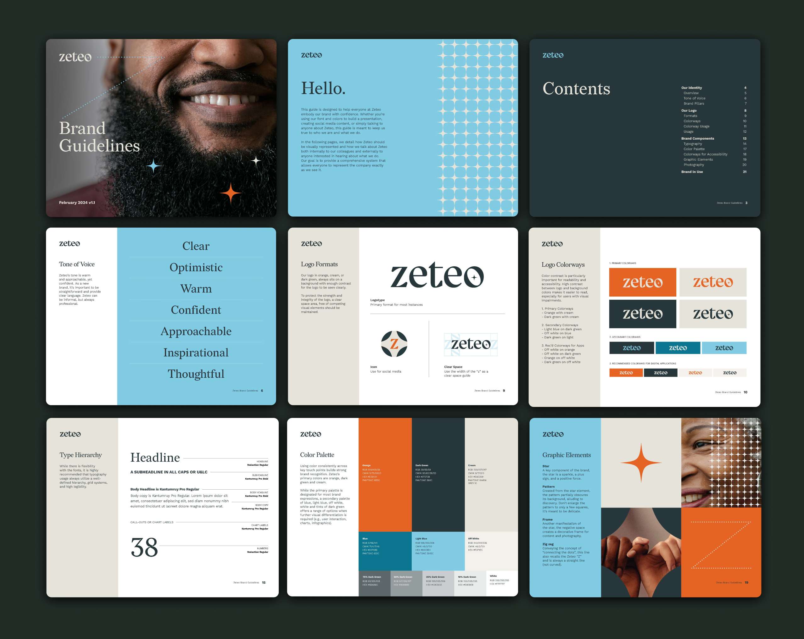
A key component of the brand, the star, is a sparkle, a plus sign, and a positive force.
Lindsay Giuffrida, Creative Director
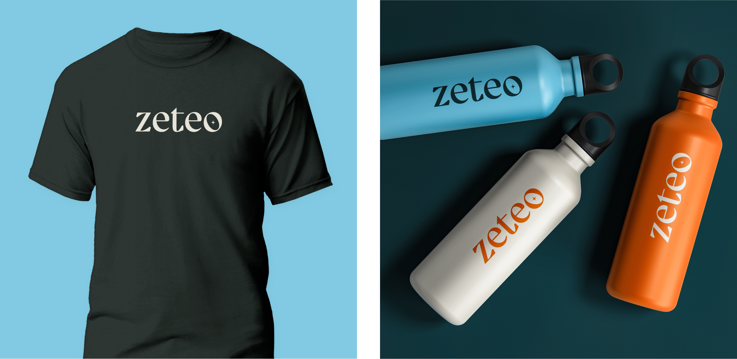
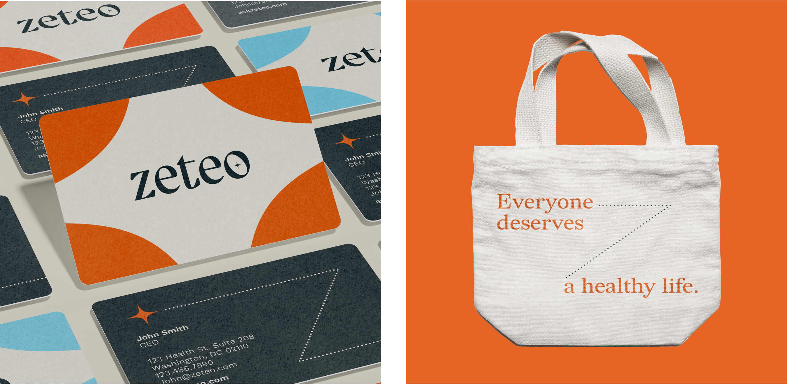
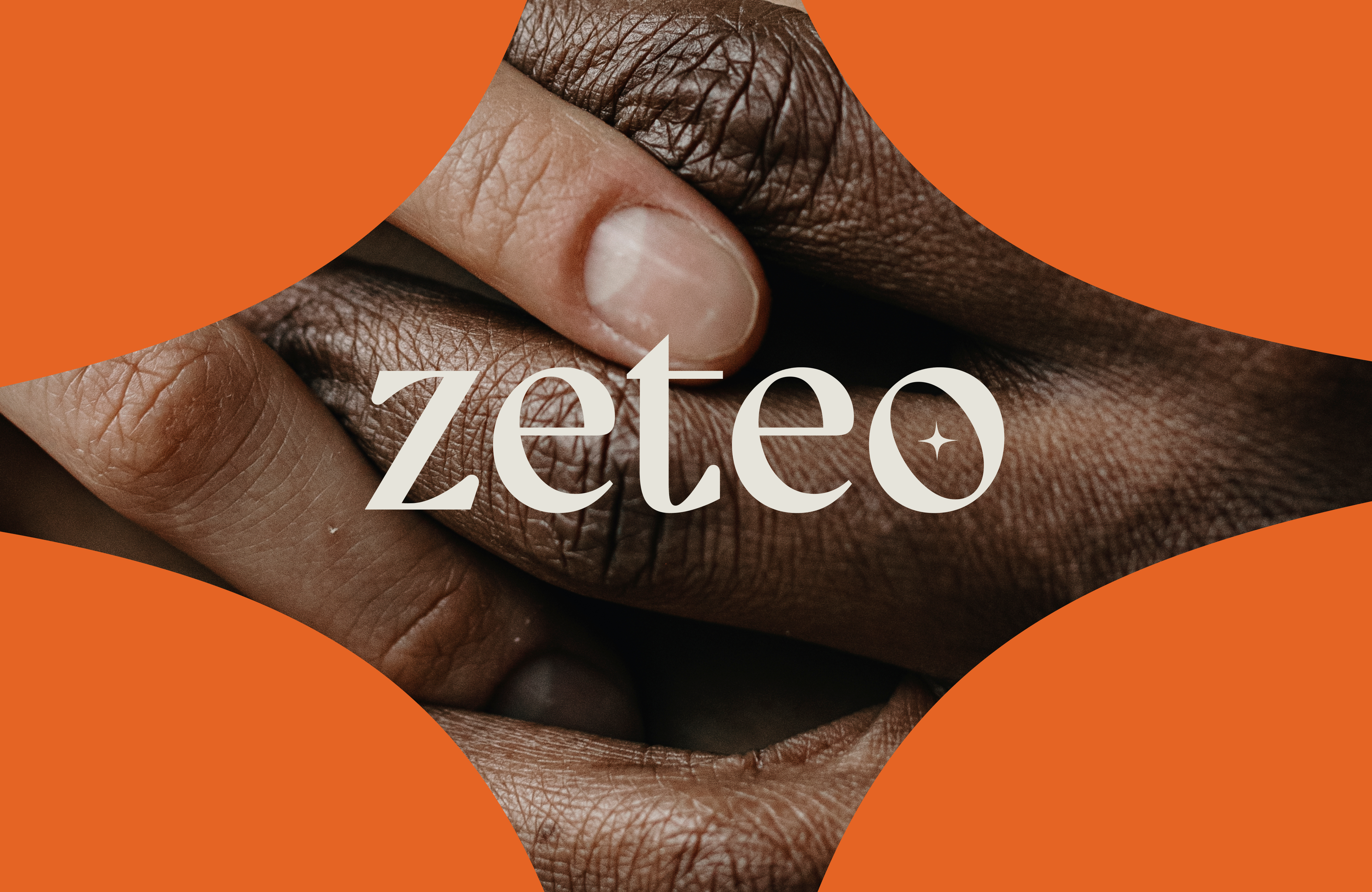
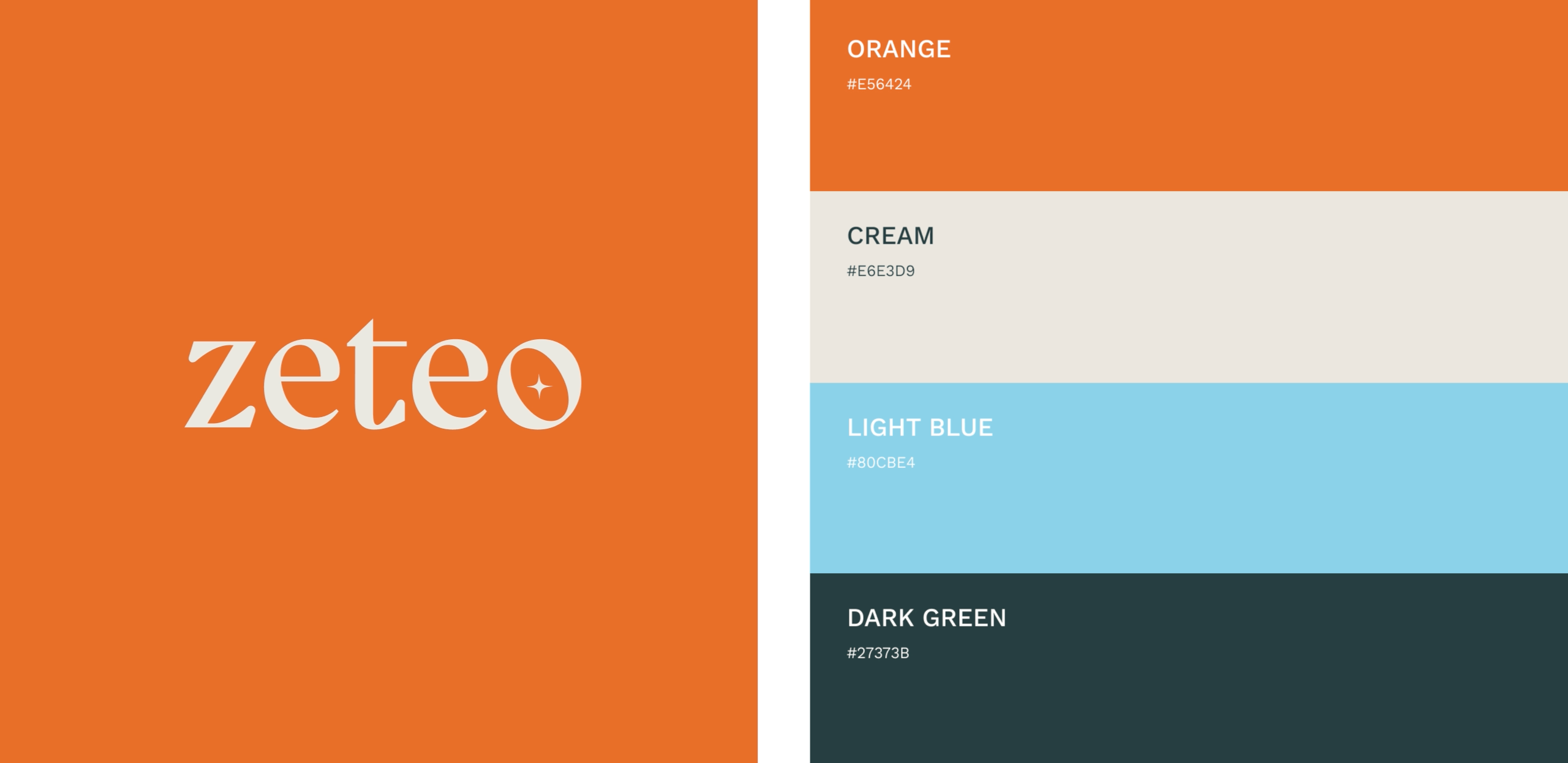
The new logo utilizes a contemporary serif typeface with a spirited personality. The “o” has a tilted counterform in which a plus-shaped star appears, depicting an orbit around a positive spark. The star shape is used throughout the brand system to generate a sense of sparkle and joy. At times, the star builds into a pattern and visual screen through which positive health can be discovered.
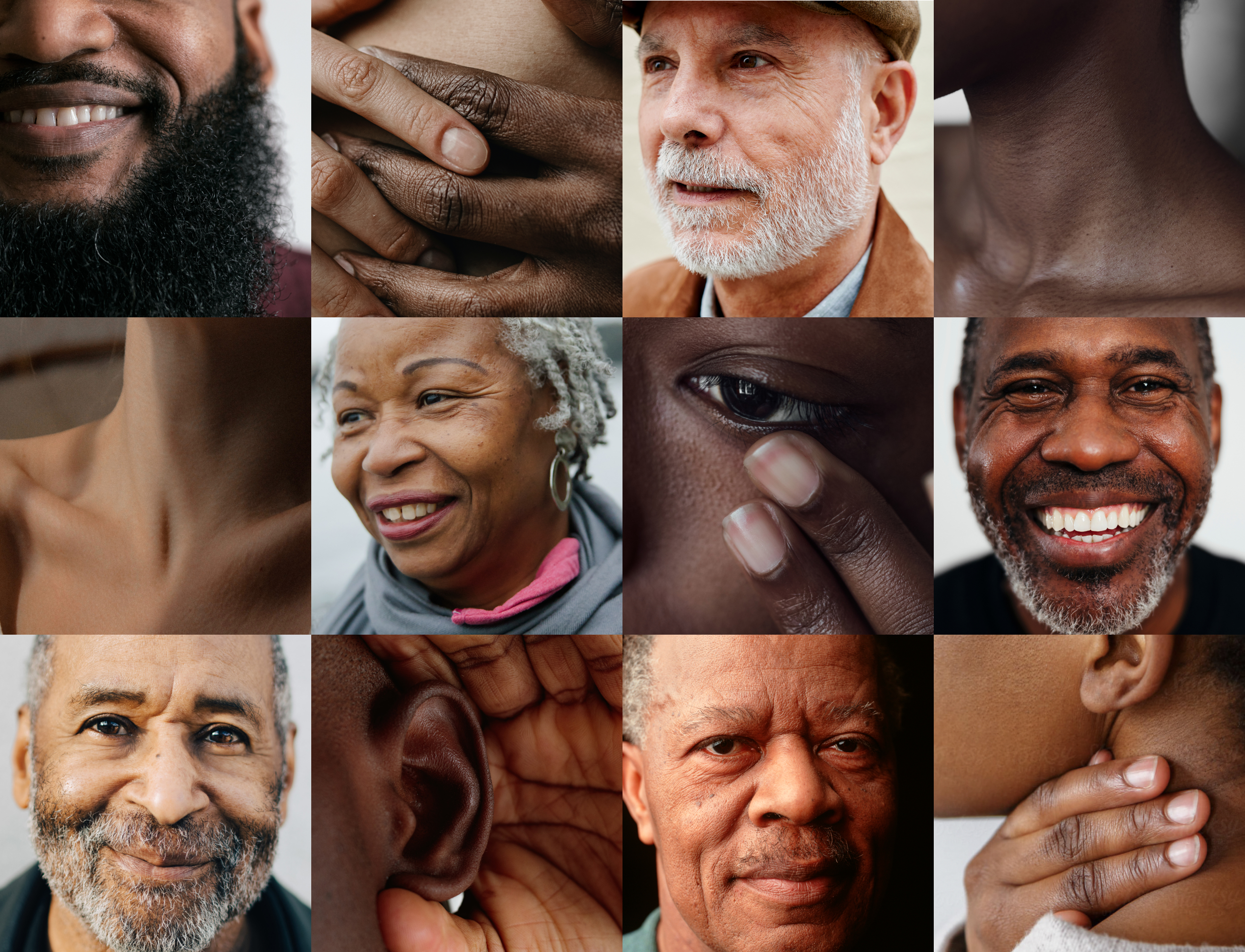
Closely cropped photographic details of people figure prominently. These cropped photos avoid health imagery clichés and celebrate intimate moments of human strength, happiness and health. The imagery also centers people as the ultimate focus for the brand. The color palette of orange, forest green, sky blue and cream is both rich and optimistic conveying an appropriate mix of strength and positivity.