Rebrand of a global clearing house from a conservative necessity to a visionary partner.
- 2017 Transform Awards North America Gold Award for Best Use of Visuals in a Rebrand
8 Point Studio was engaged to revitalize the brand identity and system for a leading global clearinghouse (referred to here as “GCG”). Creating a new identity for the “traffic controllers” of the financial world presented a unique challenge. Although consistently recognized as a leading financial support service, the clearinghouse was perceived as a trusted yet plodding and overly-conservative necessity in the marketplace. The pre-existing brand communicated the corporate stability that financial clearing requires, but did not express a commitment to innovation that current times demand and that their teams provided.
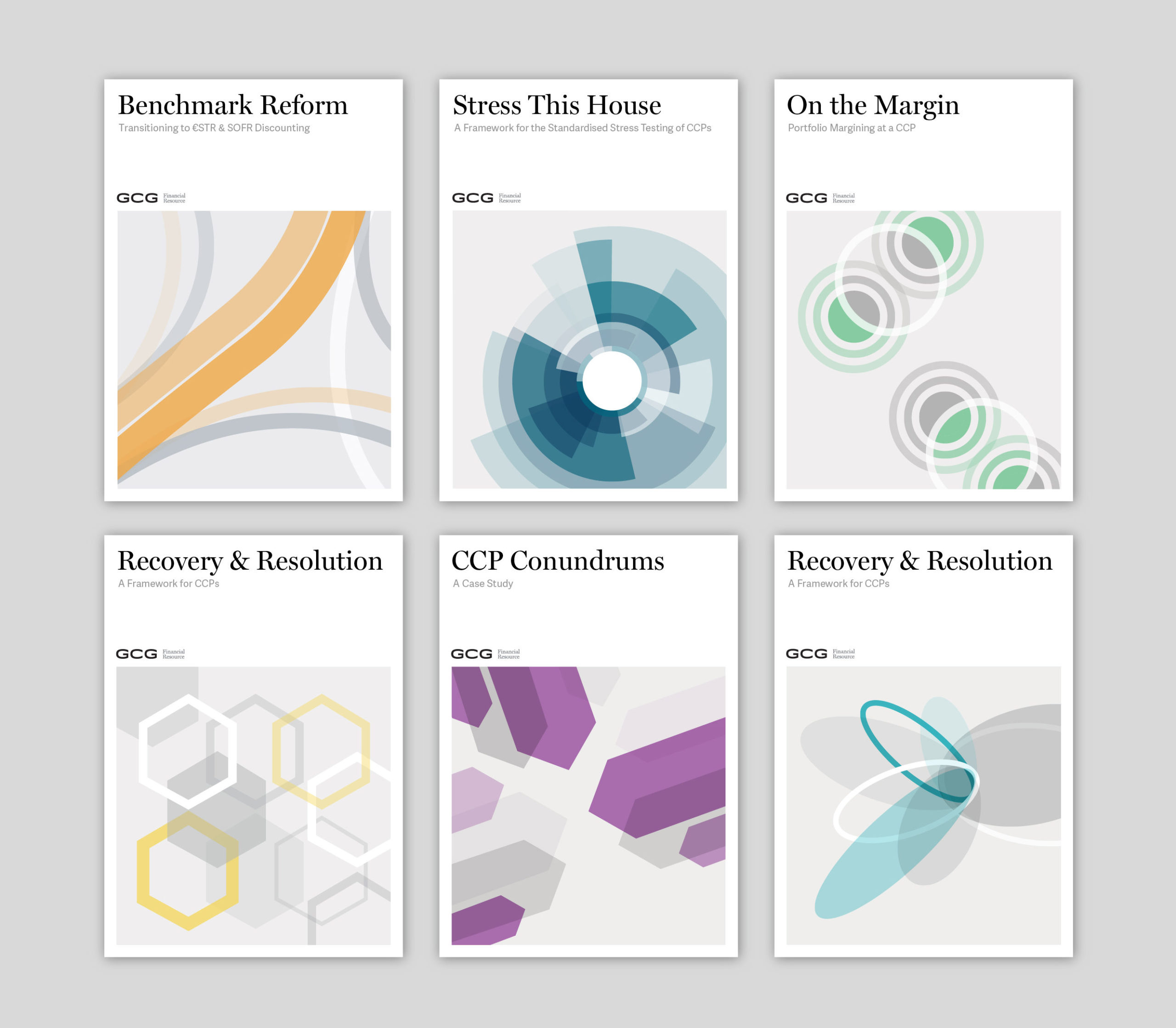
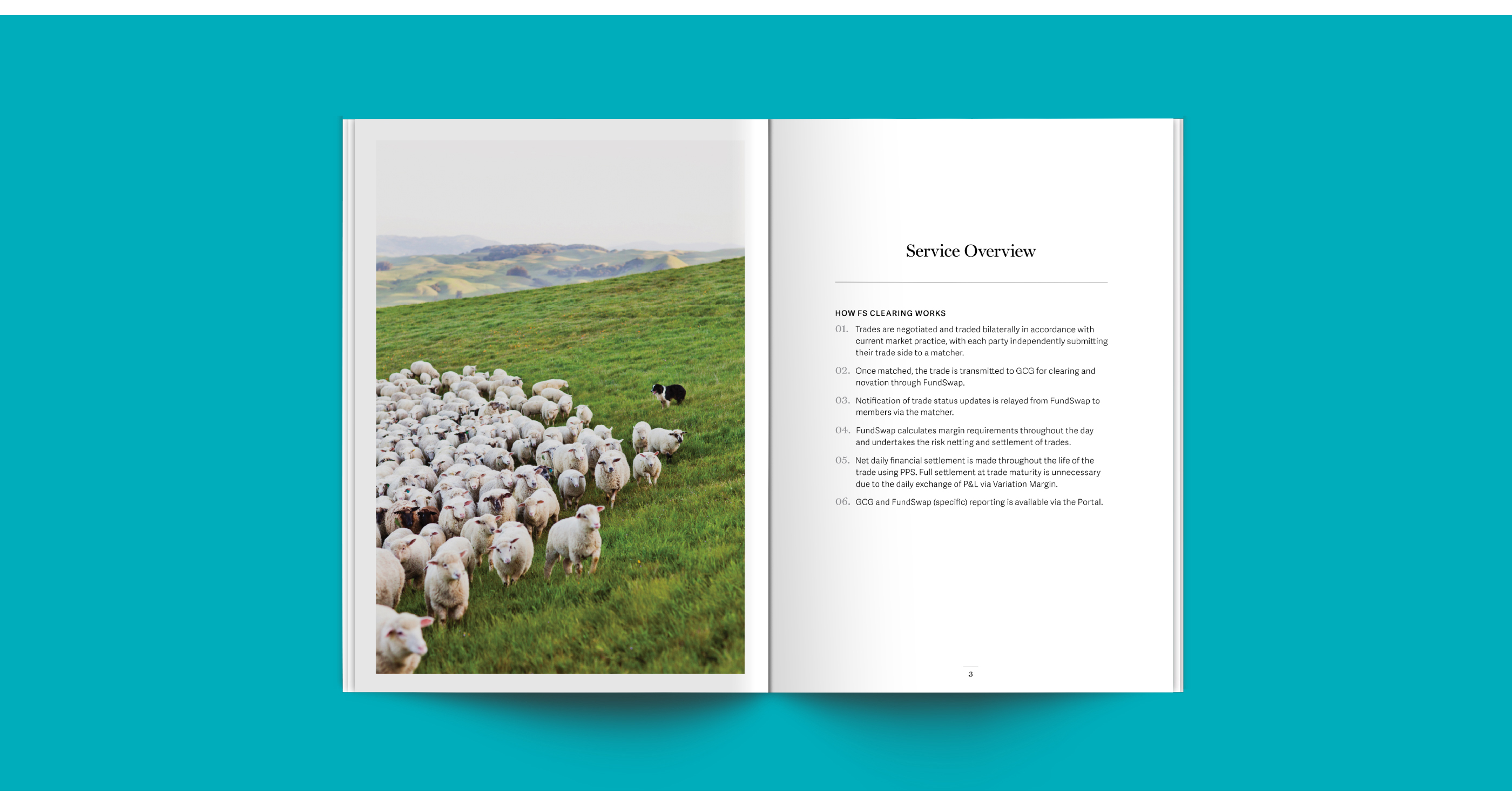
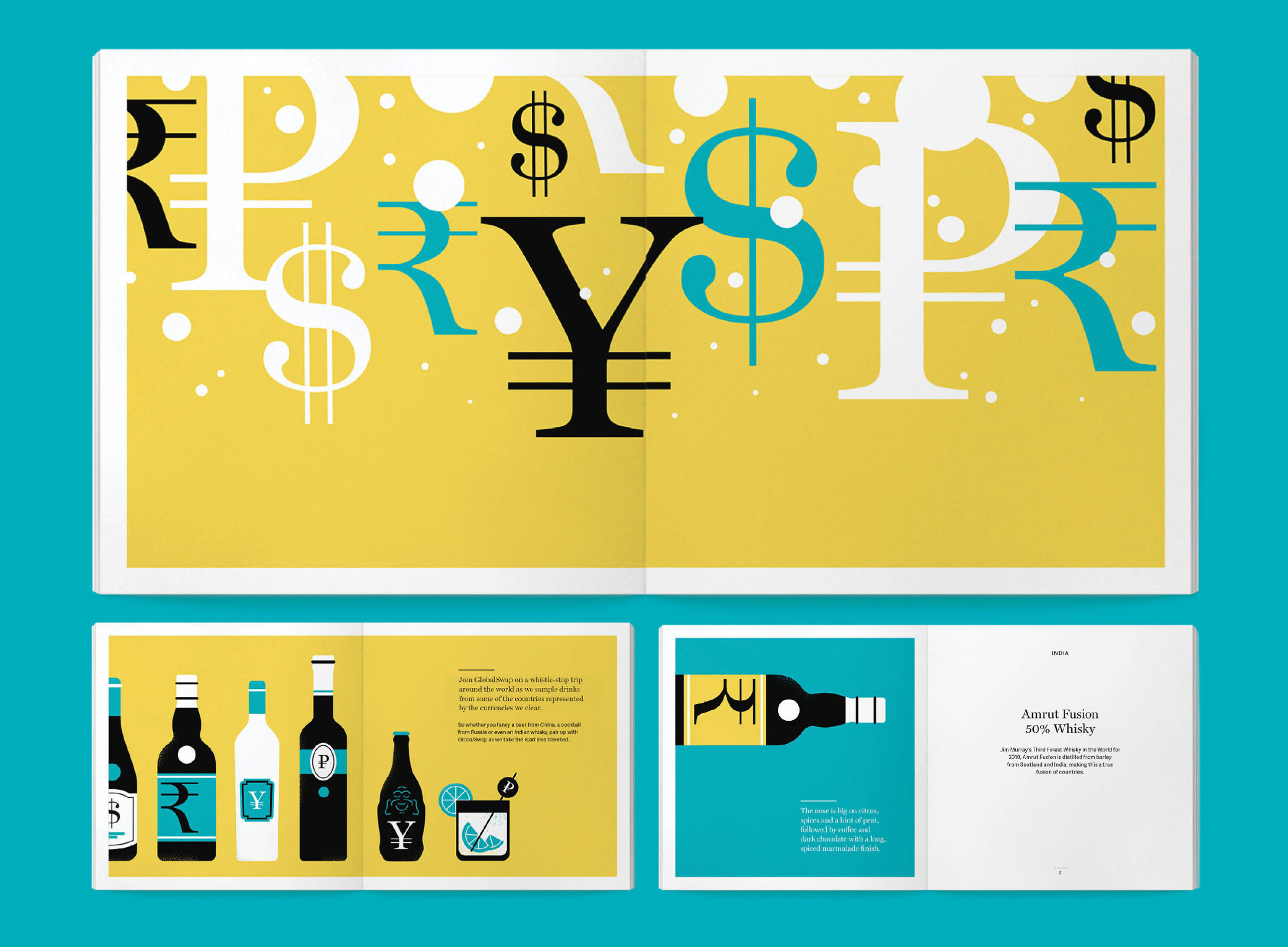
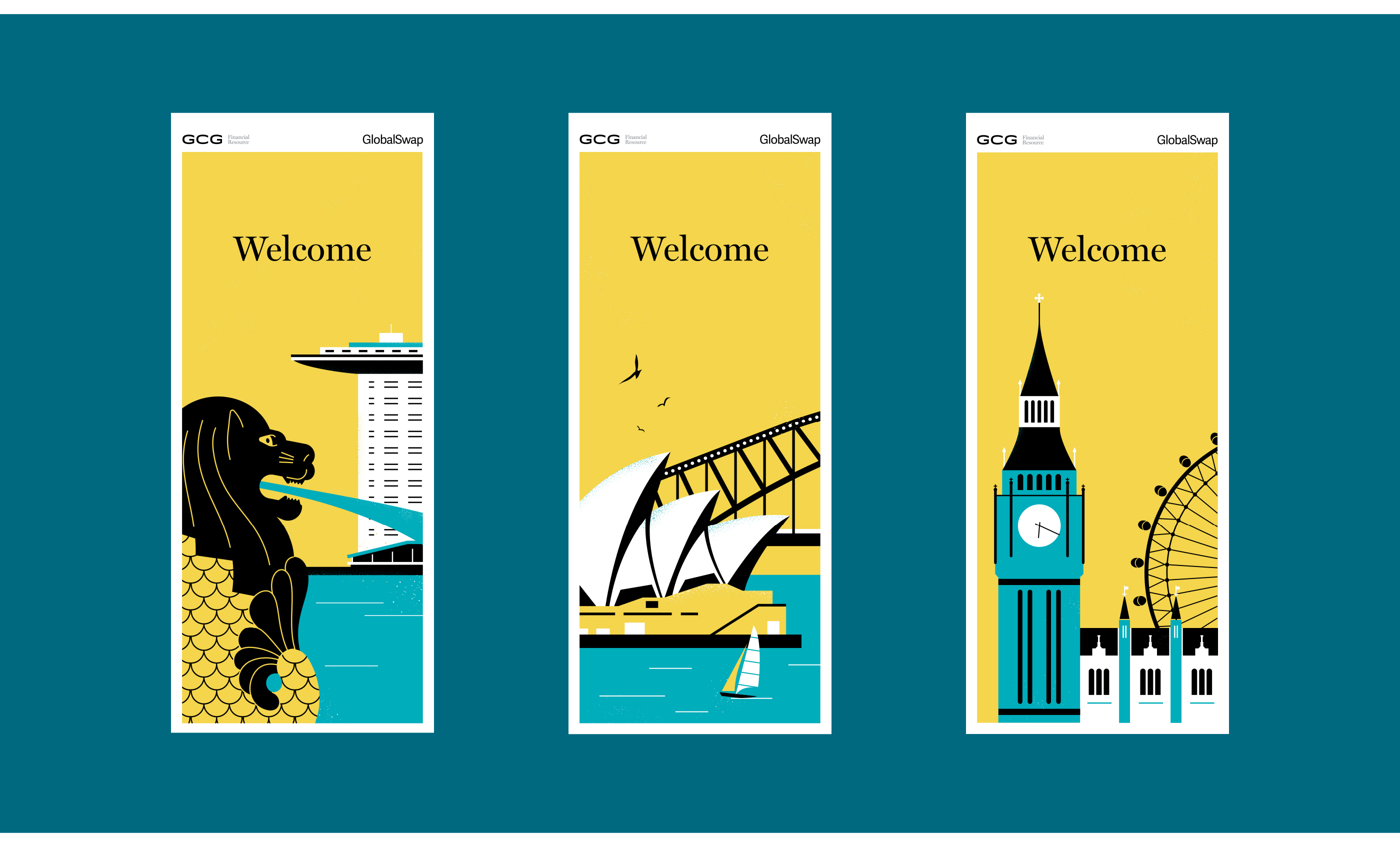
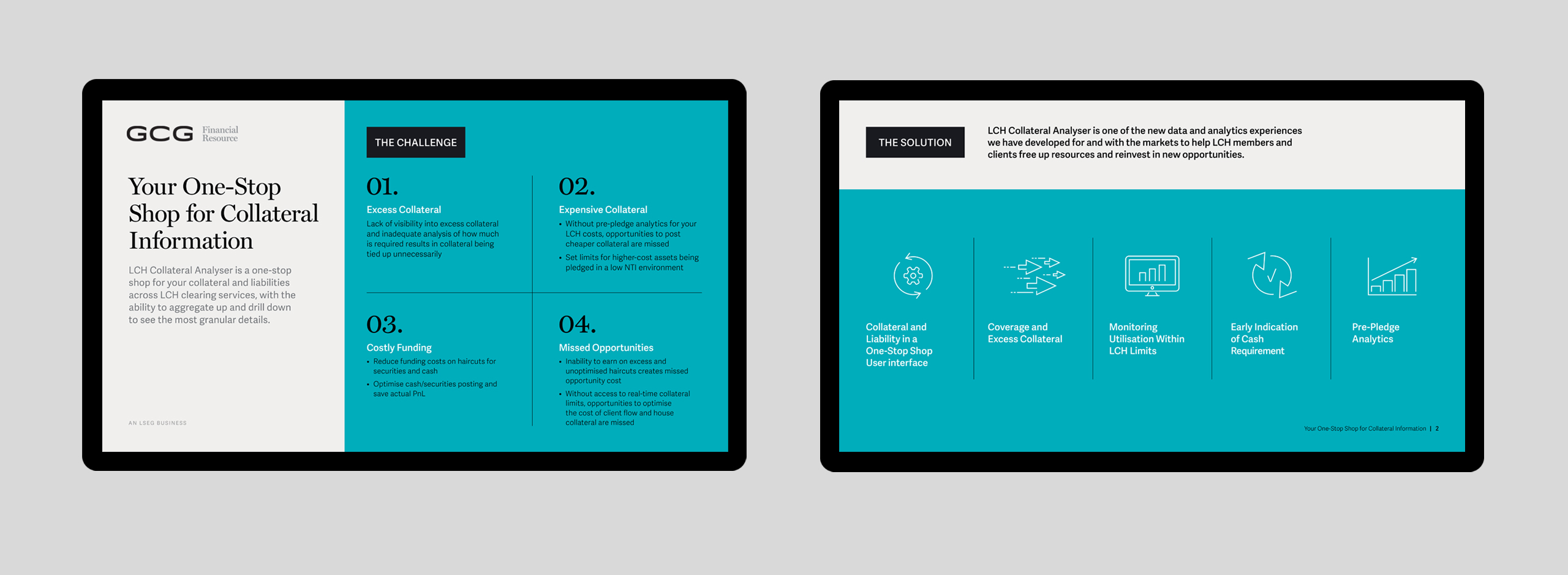
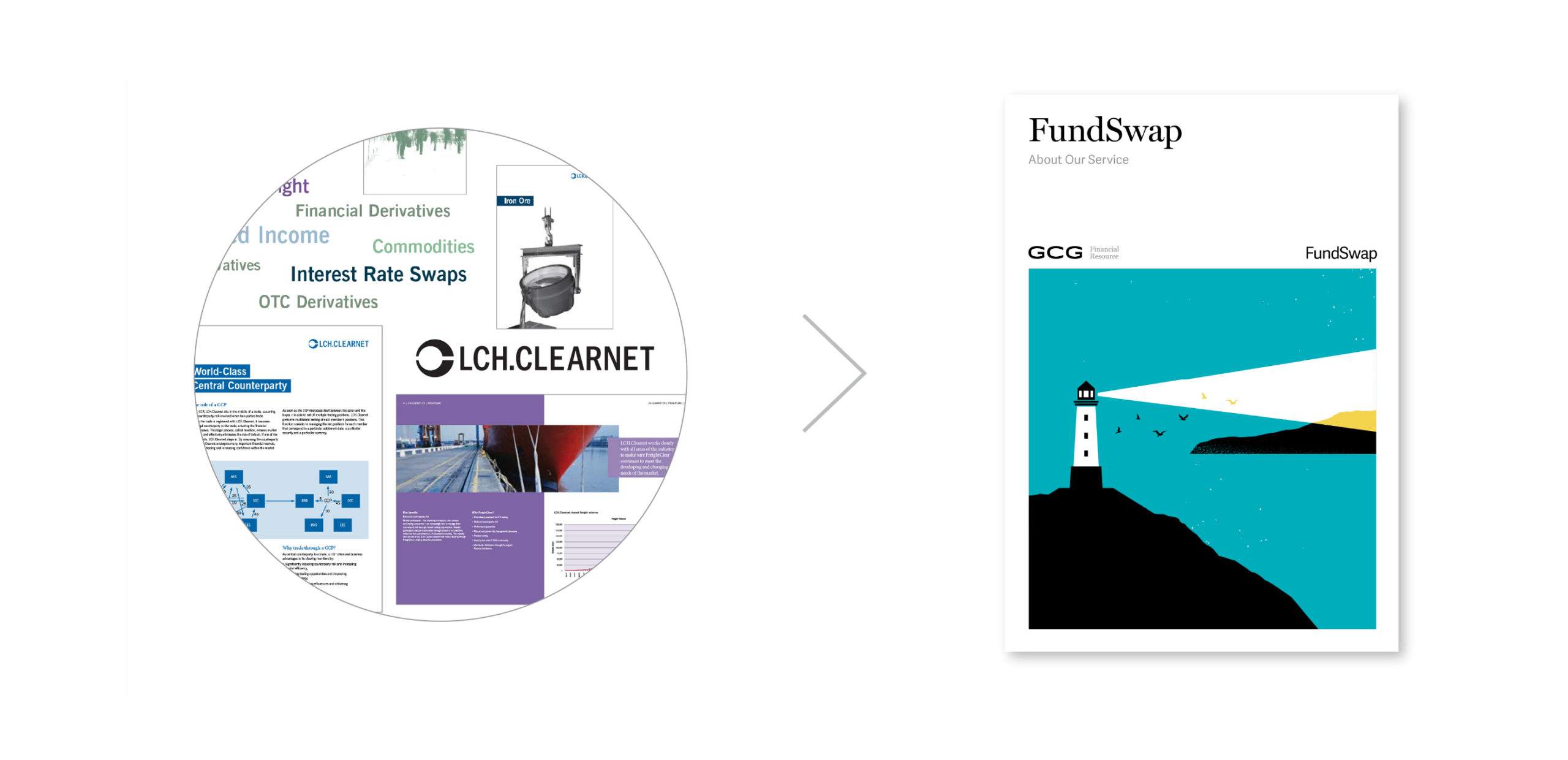
8PTS developed a new editorial-style visual system for the brand that dramatically differentiates from the competition and stands out within the financial sector. The new system avoids traditional financial tropes – canned, stock images of cities, bridges and corporate suits. This award-winning rebrand by the 8PTS team showcases the brand’s ability to solve complex financial problems with clarity and warmth while adding a charming, human touch rarely encountered in the financial sector.

The revitalized, lasting brand identity exceeds expectations, rallying clients around a vibrant and thoughtful financial partner.
Internal and external strategic research was undertaken to evaluate the company’s position in the market. Key goals emerged that focused on making the brand appear more collaborative, energetic and visionary, while maintaining core positive elements of trust, safety and avoidance of risk that clearing must embody. Curiosity, imagination and enthusiasm were foregrounded without implying uncertainty.
The new brand color, named “ClearBlue”, signals trust, quality, steadfastness and the reduction of risk. An unexpected undertone of green gently sets ClearBlue apart from the dominant use of blue in the financial world. The main brand typeface is the serif Miller, originally a newspaper font, communicating deep experience and heritage. Miller is used at a large scale to imply a confident, warm approach to communication and ideas.
The boldest move for the new brand was the selection of editorial illustration as the primary visual style. Illustration strongly differentiates within the financial space, but also expresses complex ideas with simplicity, clever concepts, creativity, viewer engagement and warmth – characteristics routinely lacking in the financial space.
Overall, 8PTS repositioned this leading financial service as an innovative creative partner in the financial industry. The rebrand invites clients to warmly engage with a thoughtful, partnered approach to clearing. The lasting rebrand successfully differentiates from the competition and continues to elevate perceptions in the financial world. The company continues to pull ahead, and has been consistently awarded “Risk Clearing House of the Year” multiple years running. Overall, the new complex and variable brand identity by 8PTS has established an engaged community around a crucial partnership with the world’s financial markets.