Creating pathways to transform businesses and uplift communities.

Benchstrength is an emerging venture capital firm focused on investing in companies transforming business and uplifting communities. Benchstrength supports the future of work, DE&I, enterprise SaaS, SMB empowerment, health, wellness, nutrition, education, and democratization of financial tools. The partners are a technology and data-driven team seeking to align with high performers and culture drivers.
Benchstrength believes diversity brings opportunity and drives performance. The founders of today and tomorrow will naturally be more diverse and therefore groundbreaking venture firms with new approaches are needed.

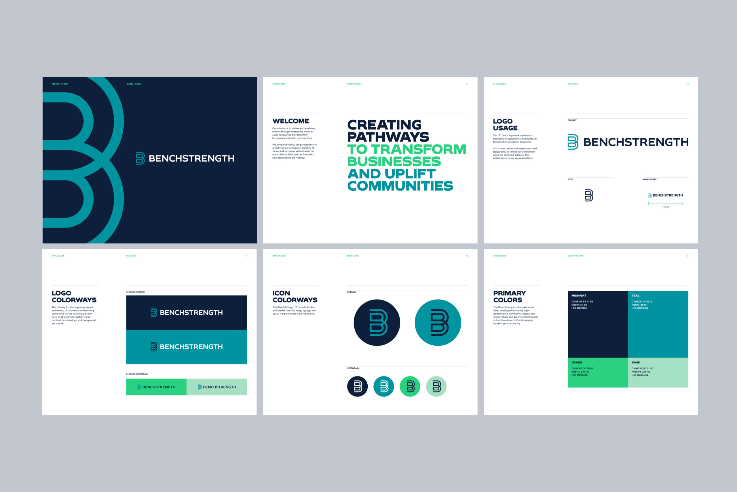
The “B” in Benchstrength’s new logomark represents pathways of opportunity and builds on a strong belief in teamwork.
Lindsay Giuffrida, Creative Director
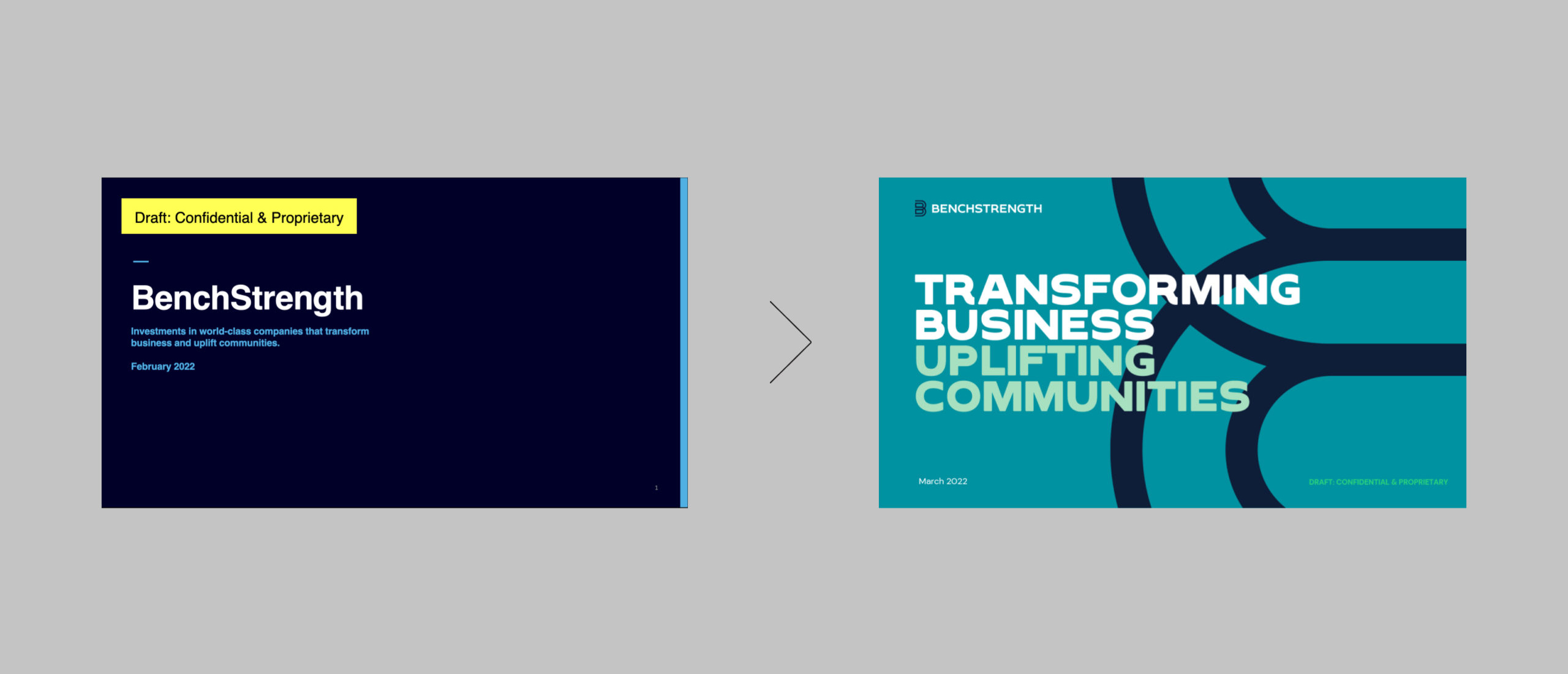
The 8PTS team conducted a brand strategy workshop to clarify Benchstrength’s positioning and set clear direction for the visual brand. The brand direction reflects a sense of empowerment and innovation along with a Gen Z desire to disrupt the status quo around diversity.
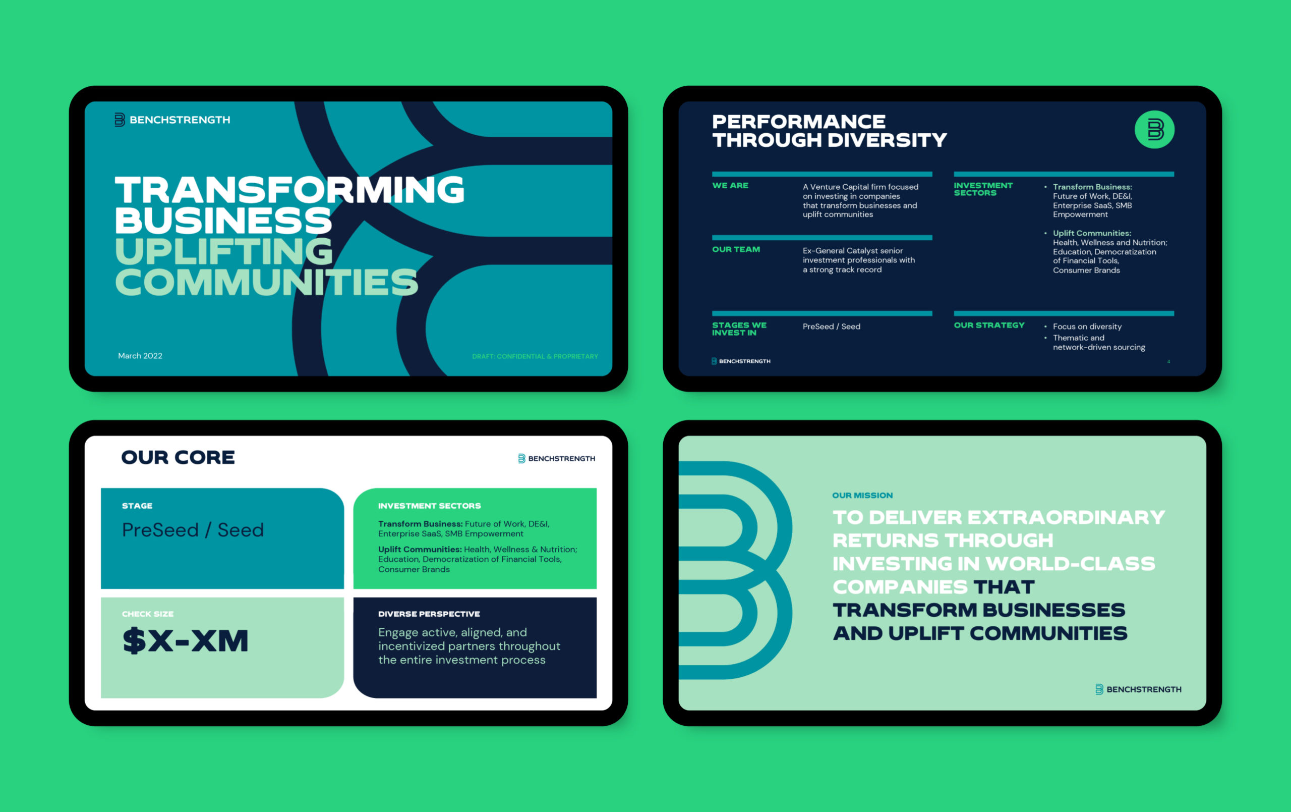
The Benchstrength color palette has been developed to convey high-performance, community impact and growth. Blues and greens, both financial colors, have been shifted to appear modern and future-forward yet trustworthy. The graphic system uses bold, large-scale linework, all caps typography and unique shapes to communicate a sense of strength paired with straightforward clarity.


